Let’s start at the end: There’s a person that loves you. They use your product constantly, almost religiously…how did they navigate their transformation from completely unfamiliar with your offering to intrigued, exploring, committing, investing, and, ultimately, finding satisfaction on the other side? That, in a nutshell, is what user onboarding is all about: guiding the uninitiated all the way to their own personal promised lands.
When we started giving serious thought to user onboarding at Chargebee, we turned to Samuel Hulick. He’s been committed to better user onboarding for some time now.
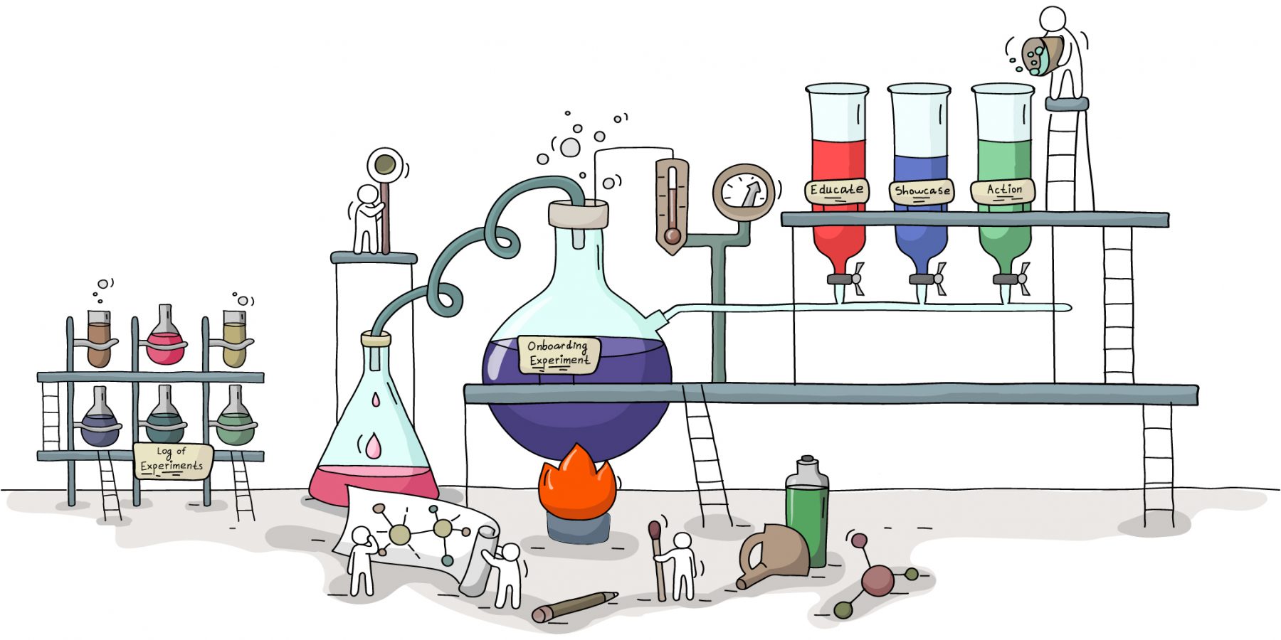
To guide a new user through this amazing journey from signed up to satisfied, he says, you have to construct an experience that does three things.
- Educate users about the problem: A problem has brought the two of you together. How deep does the connection go? Are users aware of all the fine print this problem is hiding or do you have an epiphany or two to assist?
- Showcase your features: Once users have an understanding of the problem they’re trying to solve, you need to let them know how you can help. Introduce them to the weapons you’re putting in their arsenal, in other words.
- Get some user actions going: And finally, you have to get them to take action. So they can see that better life isn’t out of reach. That it’s here…happening right now.
Okay. So somewhere in the milestones to their first a-ha moment, we had to educate, showcase features, and push users to do.
That’s a lot to do in half a minute or three.
We had no idea where to begin.
There were just
so many questions to answer before we could start building an onboarding flow.
Once a user is inside the app, what’s the first thing to begin with? Should an onboarding flow begin with the problem, a feature, or an action? Does a focus on one distract from the other? Does working backward from the a-ha moment inform what to begin with? Is the a-ha moment (or the first a-ha moment) the same for the majority of users? What do other apps do?
This post is a record of how we sorted through these questions, which ones we chose to put aside for when we had feedback coming in, and the framework we created to grapple with the most important ones.
Part 1: Putting the ‘user’ back in ‘user onboarding’
Samuel Hulick’s advice to start at the end notwithstanding, we decided to start at the beginning.
Why does someone sign-up for a product?
It depends.
Users can come to a product with any number of intentions.
Some signup because it’s a kind of solution they’ve never come across before. Some see that you’re approaching the problem a little differently and are intrigued. Some want in because everyone is talking about it. Some want in because everyone is not. Some signup because they believe in you and will buy any solution you build (they love the way you think).
The list goes on.
The more interesting question here is not why users signup but what distinguishes the different intentions of people who do?
The key is in how they relate to the problem.
On a scale of
‘I don’t know much about the problem’ to ‘I know the problem inside out’, users can fall anywhere on an awareness scale.
And this affects:
- how quickly they can start finding success in your solution, and
- how you should help them get to the promised land.
In essence, here’s the awareness of the problem scale. Users can fall all across the scale, and so approach an onboarding flow with different expectations. 
Accounting for this is addressing the intention they sign up with.
- Those who know enough about the problem might expect a showcase of features.
- Those who don’t know how to orient themselves against the problem might expect a little learning and handholding first.
- Those who have hired a product to solve a very specific part of the problem might expect action first (the ‘just show me how to get things done’ user).
While an education-focused onboarding flow might work for one, it might not work for the other. This is true of the showcase-focused onboarding flow and the action-focused onboarding flow as well.
Let’s take a look at this in action. While each of the user onboarding flows we’re going to look at serve a certain set of users well, they fail others.
Part 2: There is no ‘perfect Pepsi’ (aka examples of user onboarding in project management software)
Project management is a complex problem.
Which makes it the perfect example for this discussion—the more complex the problem, the more difficult it is to balance education, showcasing, and action.
Project management is a complex problem because it’s a discipline. Any tool that can help with it can be effective only if users recognize and internalize this.
So, how do project management tools customize for awareness levels during onboarding?
Let’s take a look.
ActiveCollab
All ActiveCollab asks you to do when you sign up is choose which sample projects you’d like to prepopulate the app with. Once you do, you’re taken straight in, to the home screen:
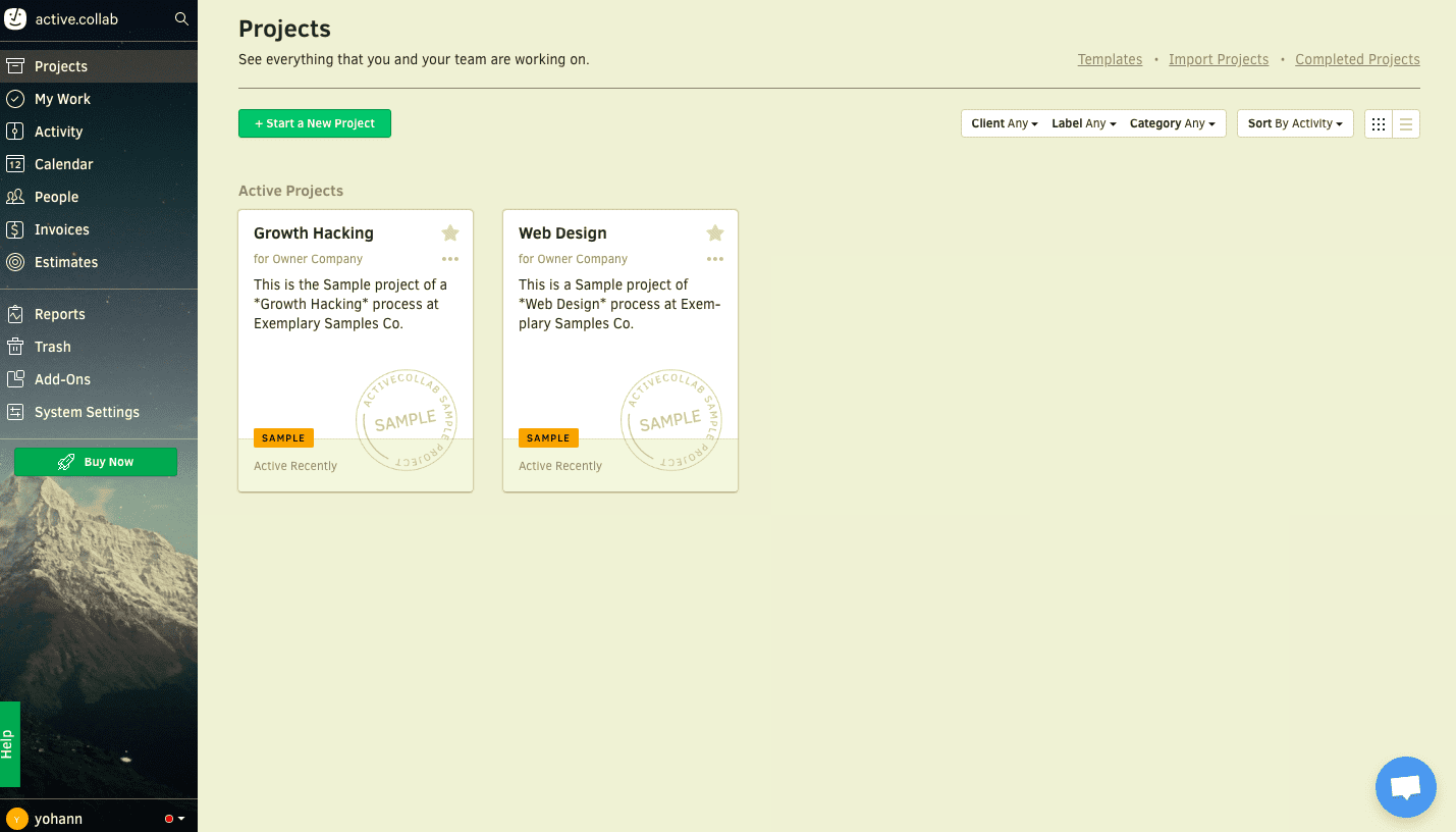
Clicking on a sample project takes you here:
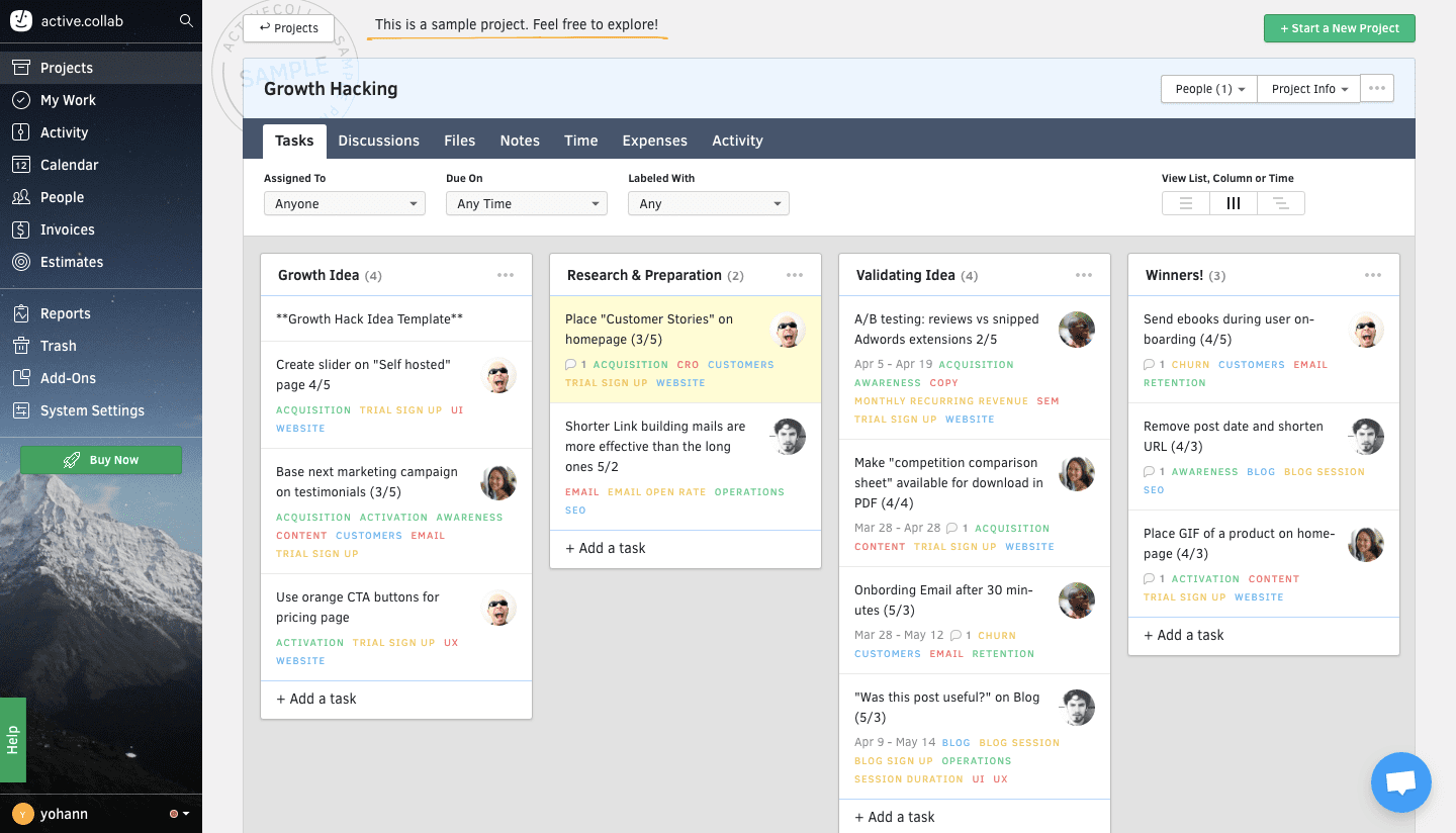
It’s clear to see that ActiveCollab is feature-focused. I can see all the tools at my disposal when it comes to breaking down a problem like growth hacking—from assigning tasks to people to tracking timelines.
But the onboarding doesn’t give me a sense of how ActiveCollab approaches project management (as a discipline). And there aren’t any tooltips, hotspots, or coach marks to help me take action.
Asana
Comparatively, Asana begins and ends with user action.
Asana wouldn’t let me inside the app without taking a few actions first.
It didn’t offer me ‘skip for now’ or ‘set this up later’ options.
If I wanted in, I had to hit the ground running.
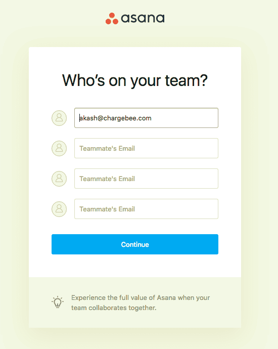
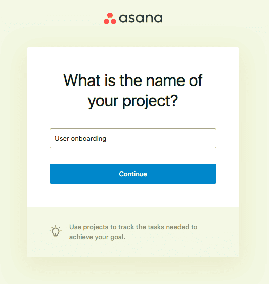
This was true once I was in the app as well.
Two things caught my attention as soon as I entered Asana (on the project page I’d just created, no less). Both encouraged me to do something—invite more people and add a task to the project I said I was currently working on.
Finish up with these, and I’m directed to another action. And another one after that.
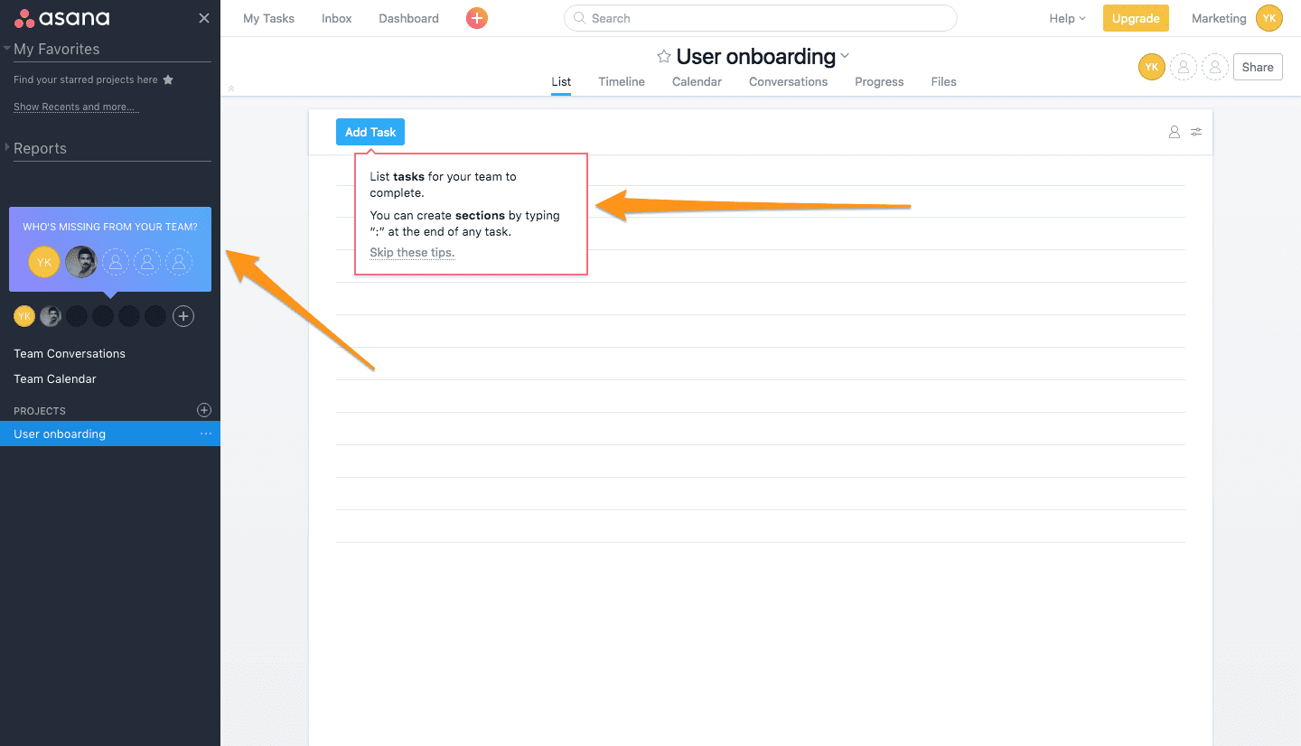
People who are trying to solve for a particular pain point (like more accountability in a team) and want to get started immediately will love this action focus.
But for someone who doesn’t know how to think about project management as yet, this action-driven onboarding can be more than a little confusing.
Basecamp
Somewhere between Asana’s action focus and ActiveCollab’s feature focus sits Basecamp (how can I talk about project management without talking about Basecamp?).
Sign up for Basecamp and a video introduces Basecamp and its features.
Two minutes later, you’re on the home screen, surrounded by pre-populated samples, and three kinds of features to get acquainted with—HQ, Teams, and Projects.
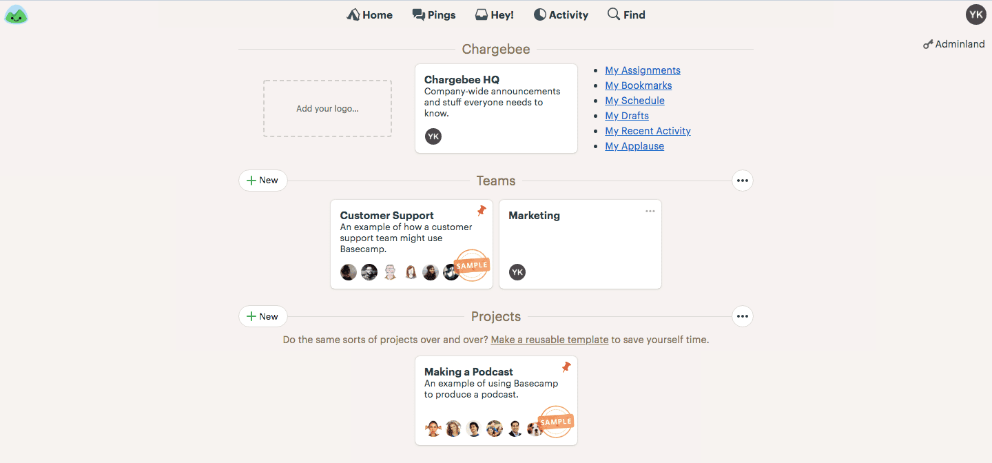
There aren’t any tooltips or pointers on the home screen, but moving into each feature changes that.
Unfamiliar features, like HQ, are more action-focused.
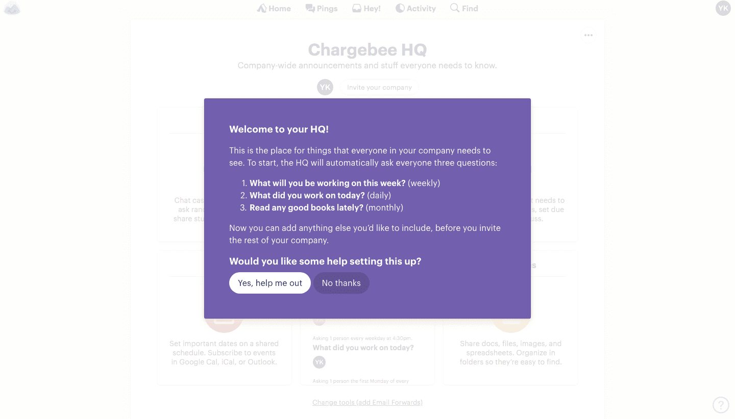
Familiar features, like projects, are more showcase-focused.
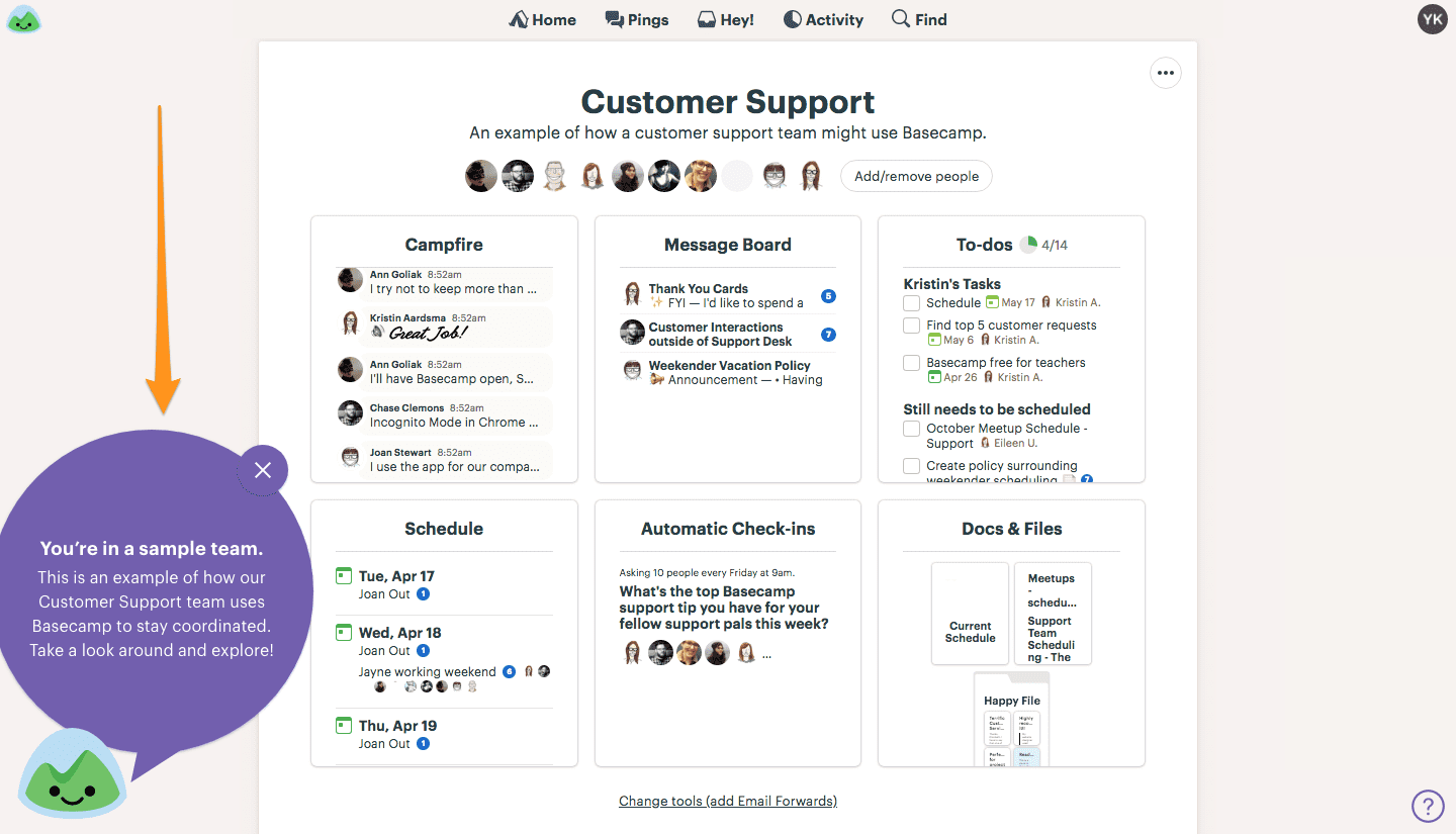
Admittedly, Basecamp does a fantastic job of balancing the elements of user onboarding. It acknowledges that certain features need more handholding than others.
The problem, like Asana and ActiveCollab, is the lack of education.
This is particularly risky in Basecamp’s case because it solves a much bigger problem than project management.
Basecamp is “a way to divvy up work, hash things out quickly via chat, make big announcements, keep discussions on-topic, store and organize key files and assets, lay out milestones and deadlines, and have regular check-ins to make sure everything’s all right”.
It’s a tool that helps users “steer their business away from random chaos and towards intentional control”, as Jason Fried, Basecamp’s founder, says.
Not just steer a project, but steer a business.
I need to be thinking about the problem of ‘how to work together’ more than I am about ‘who’s on top of this task’ to get the most out of Basecamp. And their onboarding doesn’t tell me how to start doing this.
Freedcamp
Unlike ActiveCollab and Asana, Freedcamp begins with an education-focused question after sign up:
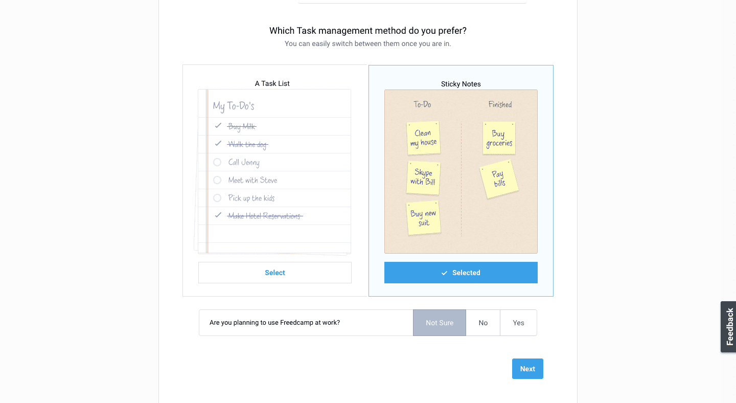
The question frames something new and unfamiliar (project management) against something I’ve always been doing (task management).
Between the to-do list and the sticky notes, Freedcamp is showing me how to approach project management.
It’s followed by a request to invite the people I’m collaborating with, and a breakdown of what collaborators can do inside the app. More education.
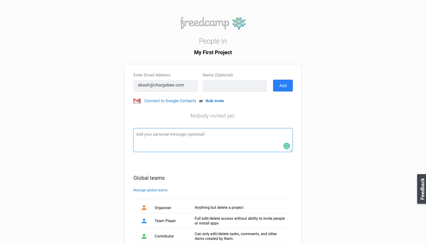
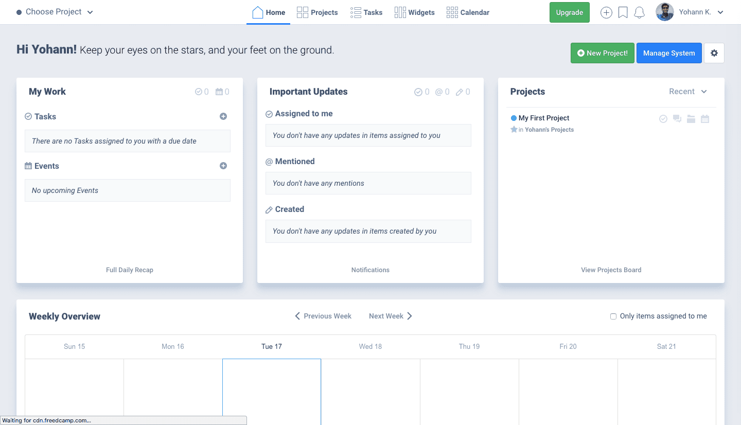
Once inside the app, however, there’s nothing guiding me to take an action, and features aren’t on display like they were in the ActiveCollab sample project.
Four examples, so far, with three approaches to user onboarding. Each balances education, showcasing, and action a little differently, leaning on one of the three more than the others.
I’m sure each user onboarding flows work well for some users.
- People who want to learn how to think about project management will appreciate Freedcamp’s education focus.
- People who know how project management works and want to check out what their choice of tool is equipping them with will love ActiveCollab.
- People who are trying to solve a particular pain point (like more accountability in a team) and want to get started immediately will love Asana’s action focus.
But there’s a lesson to take away from each app’s onboarding focus.
Can working awareness of the problem into an onboarding flow make it work for
more users?
Part 3: Experimenting with working user awareness into a user onboarding flow
Here’s what we began with.
Everything we learned from all the amazing resources on user onboarding said:
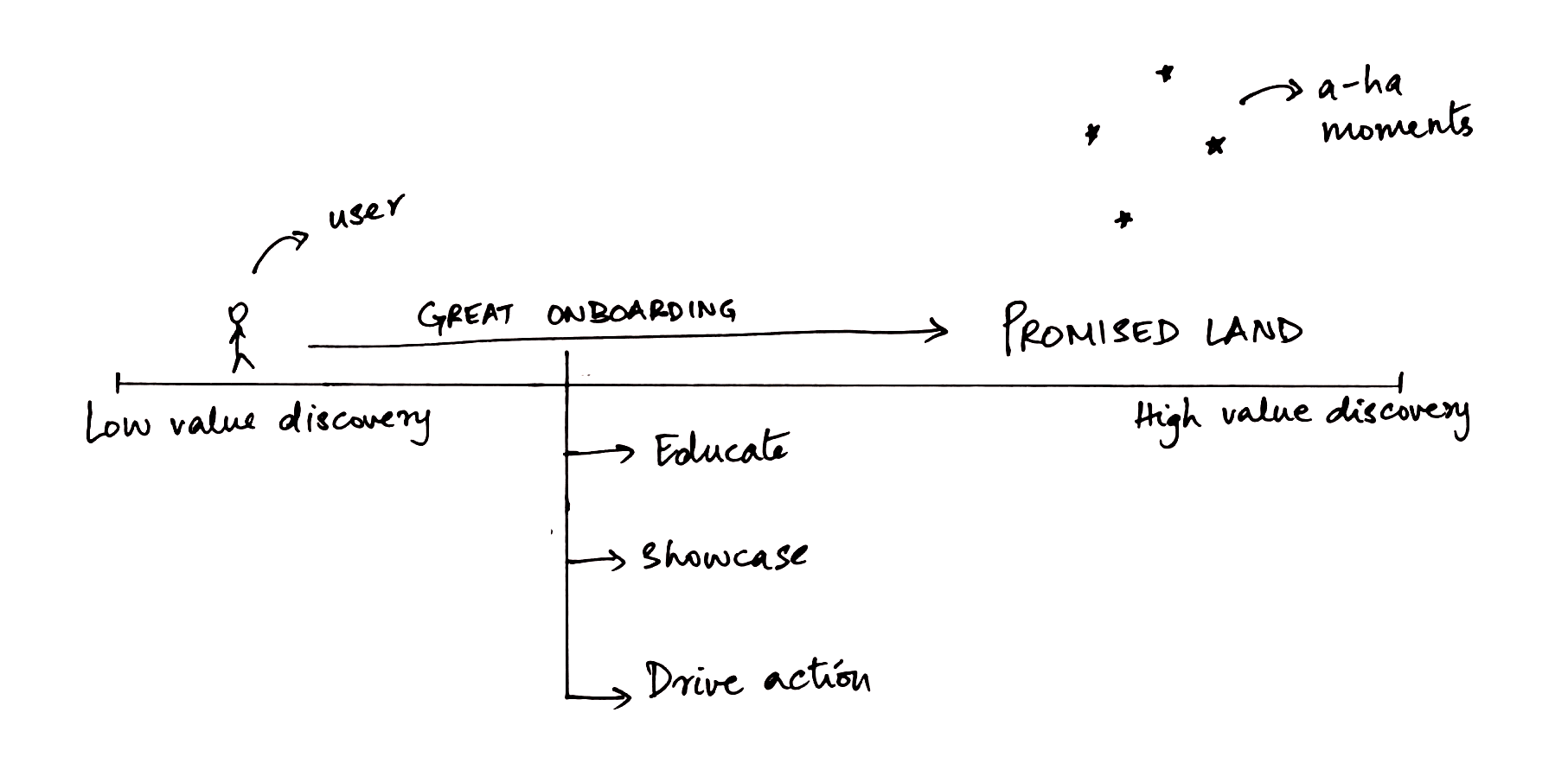
From actually trying to get onboarding off the ground, though, we learned that awareness of the problem is a great way to get a sense of what a user might need to start finding success in a product. It’s led us to conclude something like this:
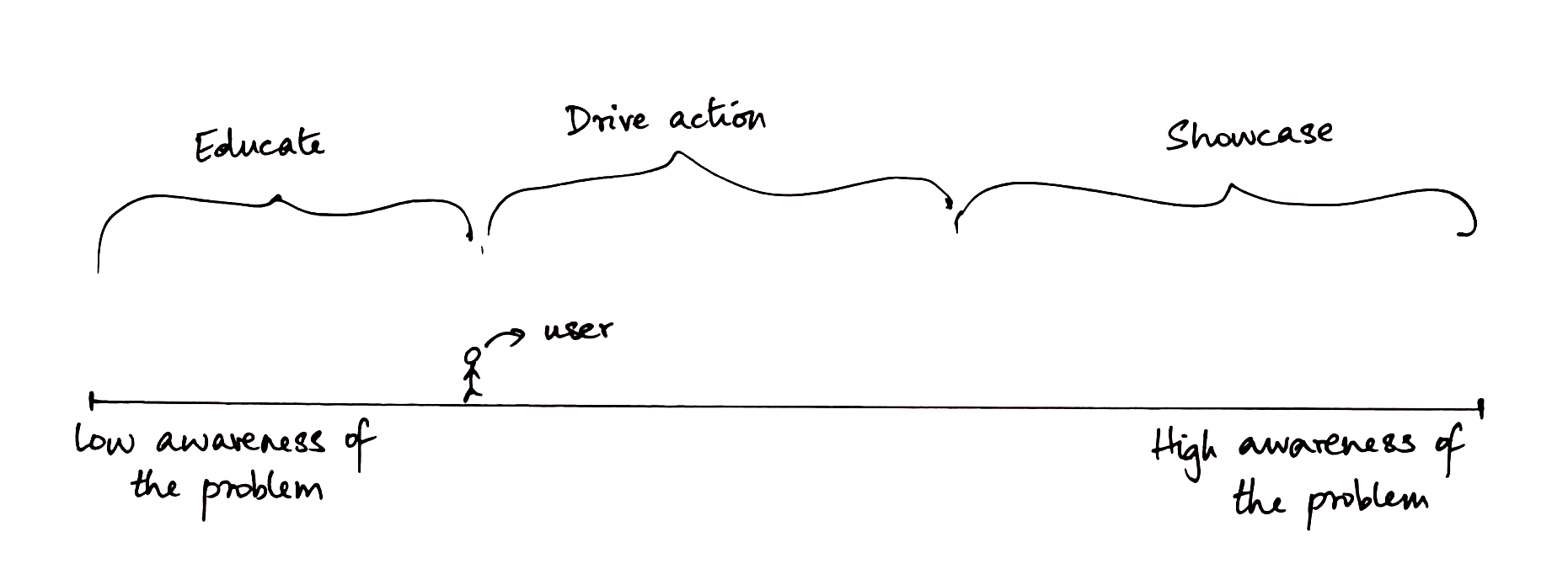
Putting the two together gave us a framework that looked something like this:
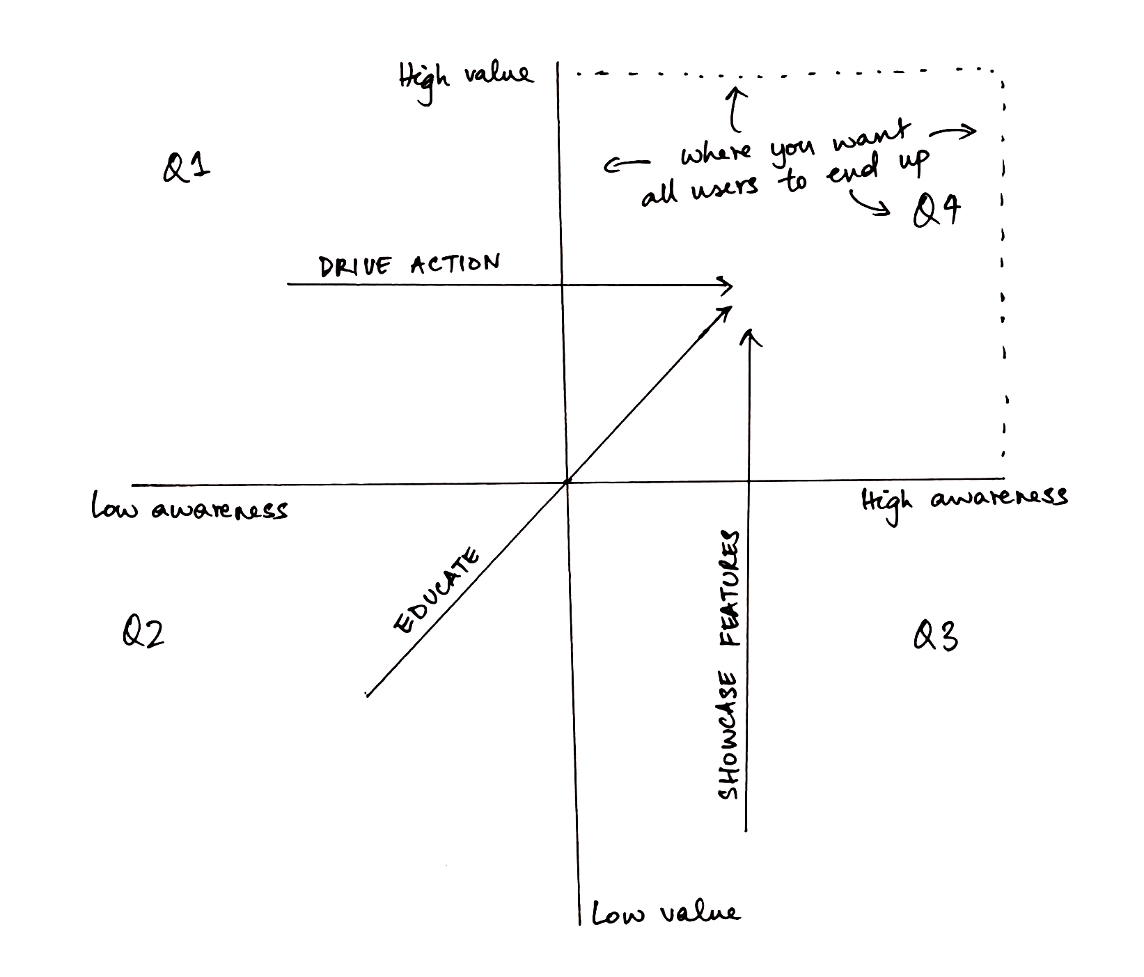
Ideally, all users end up in quadrant 4 (high awareness, finding high value).
This framework provides a formal way of thinking about how to get them there, and where to kick their journeys off:
– Quadrant 1 (partial awareness, partial value):
Users with partial knowledge of the problem. Knowing enough about the problem to have a pain point.
These users come onboard expecting to get things done.
Example: Chargebee. Invoicing is a pain point that introduces many entrepreneurs to billing as a problem. They come to Chargebee expecting to solve the problem of invoices alone.
– Quadrant 2 (low awareness, low value):
Users who don’t know how to think about the problem and, so, are not equipped to find value in your product as yet.
These users come onboard expecting to be oriented to the problem before they can start solving it. They need an education-focused introduction to your app, how you’re thinking about the problem and how you believe it’s best solved.
Example: take a look at this onboarding email that YNAB sends out to users who sign-up— “YNAB isn’t a budgeting tool, it’s a method…the first month is about learning”:

– Quadrant 3 (high awareness, low value):
Users who know the ins and outs of your problem but find that your solution isn’t solving it for them.
These users come onboard expecting to see what you’re bringing to the table. They’ve probably evaluated your competition. They need to see your features ASAP.
Example: Most B2B SaaS. Users don’t contact sales without a thorough evaluation of the problem and the solutions that are available out there. With multiple stakeholders involved, choosing software to help them is no small decision.
Part 4: What does this mean for Chargebee’s user onboarding?
There’s a pretty strong conclusion to draw from all this.
Maybe there is no such thing as the perfect onboarding flow.
Maybe onboarding needs to be customized to the expectation that a user is bringing along.
As PepsiCo discovered, there is no such thing as the perfect Pepsi, only perfect Pepsis.
So, where did this leave Chargebee?
In quite an exciting place, actually. Customizing to expectation is not a new problem for anyone in SaaS.
We think about awareness when we build landing pages and new features.
Why not extend this thinking into constructing user onboarding flows as well?
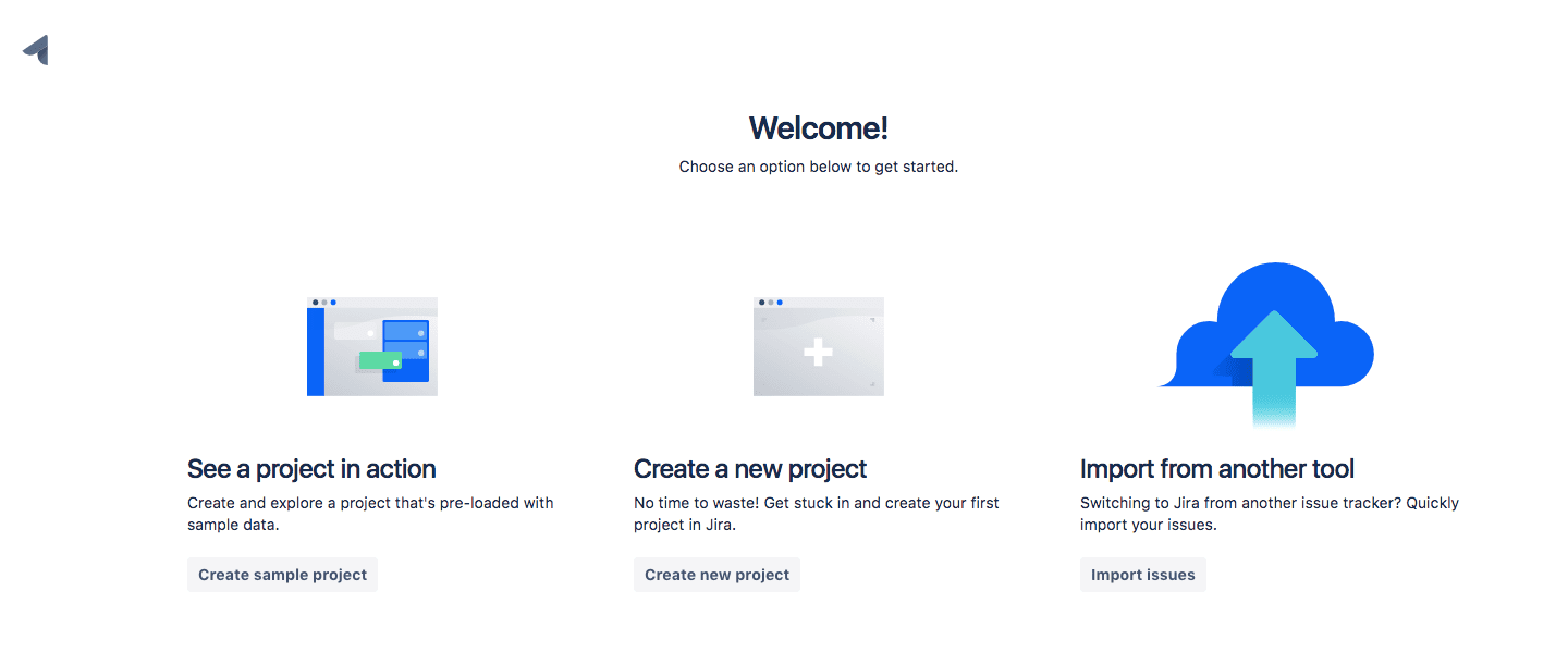
There are great examples of onboarding flows branching off into multiple parts to account for intention, or accommodate different kinds of action.
Here’s Jira, for example, catering to different intentions:
And PayPal, helping users take action:
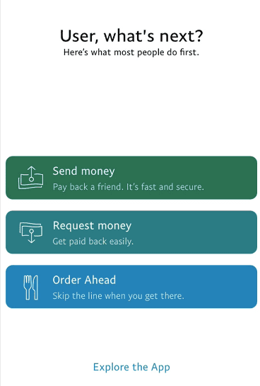
Of course, there is a lot to do before we can get it off the ground. We’re still figuring out how to segment users who sign up for Chargebee by awareness level. We’re trying to pinpoint how awareness level affects a-ha moments. We don’t know what the best metric to judge user awareness ought to be.
One thing is certain though: the way we’re talking about user onboarding is a little more complete now. We know what user onboarding has to do. And when it comes to constructing the milestones that lead to the success we have a sense of how to actually decide what different users need.
Conclusion
Good user onboarding does three things—it educates users on the problem, it showcases the features of your solution, and it signals that that ‘better life’ the user signed up for is right around the corner.
The problem is that working all three into one onboarding flow is really hard. Especially if you’re trying to solve a hard problem.
This is something we learned the hard way when we were trying to construct our own. There were always gaps to account for, always some users we weren’t talking to in the best way possible.
To solve this problem, we figured we’d use user awareness of the problem as a guide. After all, how users relate to the problem that brought them to Chargebee can inform what they need to find success in it.
We came up with a framework that balanced awareness of the problem with how much value users could find within the app—a formal way of thinking about how to address the different intentions that people approach an onboarding flow with. Not just when they sign up, but every time we notice that they could be doing more with what we’ve built for them.
