Gary Thuerk, the then marketing manager of the now defunct Digital Equipment Corporation (DEC), sends a mass email to 397 prospects using the Advanced Research Projects Agency Network (ARPAnet) of the US Defence Department, with an invite for a product demo.
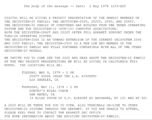
He clicked send. And that’s how it all began. Image Source
The emails win them sales worth of more than $12 million. And, it was also the first email marketing campaign.
Or, as critics like to call it, the first spam.
With users becoming increasingly wary of unsolicited emails, the triggered email was born as a solution, which is sent only to those people who have performed a particular action.
A transactional email is one such kind of triggered email, and are by far, the most favorite child among its siblings.
This article will outline exactly how to get started with transactional emails, and how to do them right!
What Are Transactional Emails?
Transactional emails are automated emails that are sent to your customers, triggered by their activities within your app, like signing up for a plan, changing a plan, modifying their user details, etc.
They’re incredibly important to growing businesses, as they tend to have a lot more success than other types of marketing emails.
How much more success?
How about 8x more clicks and 6x more revenue?
Clearly then, the transactional email is seriously powerful, and they’re something you’re going to want to nail.
There are four main types of transactional emails, namely:
- Welcome emails – the first “Hey! Glad to have you on board” emails sent to new users
- Confirmation emails – emails that acknowledge that a process, usually started off by the user, is complete (eg., order confirmation, file export, payment receipt, etc.)
- Notification emails – emails that, well, notify the users, about particular events that happen in their app (eg., password resets, updates in important metrics, updates in tasks, etc.)
- Reminder emails – emails that nudge the users to carry out an action that’s pending or is nearing a deadline (eg., shopping cart abandonment, subscription renewal, incomplete account verification, etc.)
Perhaps the biggest benefit of transactional email is that they can be entirely automated. And don’t just love a good bit of marketing automation?
That means you can use a platform like Chargebee to send automated email notifications to your customers that are based on specific actions.
For example, let’s say a customer’s credit card fails upon renewal of their subscription. An automated email can be sent out to them, letting them know they need to update their credit card details. Easy as that.
Subscription renewed? Send through a confirmation email.
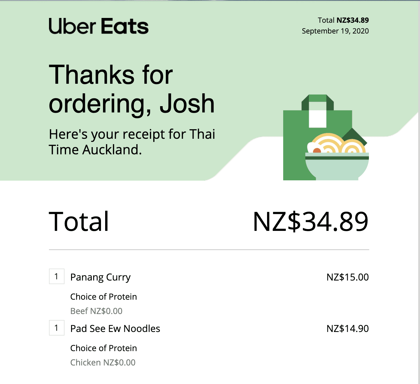
Another common example of an automated transactional email is sending receipts for online purchases, like this order confirmation email for Uber Eats:
We mentioned before that transactional email is the favorite child of the email marketing industry. Here’s why:
- Transactional emails boast 2x the unique open rates of non-transactional emails.
- The median click-through-rate of transactional emails is 4.8%, that’s 3 times higher than that of non-transactional emails (1.6%).
- Saving the best for the last: about 43% of transactional emails are clicked on after being opened (click-to-open rate), with respect to top-quartile performers. That’s 13.2% points higher than their non-transactional counterparts.
What do these impressive numbers spell?
Opportunities.
Opportunity to have meaningful conversations. Opportunity to offer personalized product recommendations and/or support. Opportunity to build and strengthen relationships.
And this crisp guide will help you in leveraging the might of these under-appreciated emails, and turn those opportunities into meaningful outcomes.
Let’s begin.
How To Get Started With Transactional Emails – 8 Slick Tips
This section will give you a step-by-step guide to optimizing your business’ transactional emails with 8 strategies, with real-world examples, you can implement today.
1. Keep It Simple
A transactional email from Squarespace:
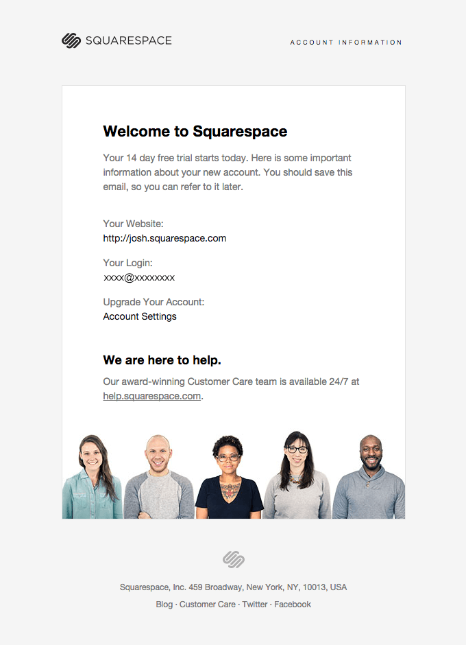
Simplicity at its best.
According to Paul Grice, an effective communication in conversation should obey these four maxims:
- Maxim of Quantity -Try to be as informative as possible, and share only as many details as required (and not more)
- Maxim of Quality – Try to be truthful, don’t share any information that’s either false or lacks ample evidence
- Maxim of Relation – Try to share information that’s relevant to the conversation
- Maxim of Manner – Try to be brief and orderly, and stay away from obscurity and ambiguity
And your transactional email messaging should abide by each of those principles.
Hack away at the fluff (the confetti can wait), stay laser-focused (every email should have one purpose only – not more than that), and give them just the right amount of details that they need at that point in time.
Notice how Squarespace ticks all those boxes, and even manages to earn extra brownie points, by squeezing a couple of smiling team members towards the end, as a way of making the intimidated users feel at ease about the whole process.
(Note: They could’ve also provided a link or two to tutorials/videos/guides to make the best use of the product. That would’ve been a good starting point for the new users.)
The big win achieved by keeping your transactional message short and sweet is higher response rates. Emails that are between 50 and 125 words can achieve a response rate of 50%.
Compare that with the industry average response rate (around 14%), and you’ll be asking yourself why you ever wrote long emails in the first place.
2. Shed the automated tone. Sound like a human.
Sounds obvious, right?
What else would you want to sound like?
Well, the challenge here is that the transactional email is, by nature, automated. So when marketers are writing them, they often forget the fact that there is going to be an actual person on the other end of the email, just not right away.
Unfortunately, they’re missing out on some strong results, given that personalized emails get 6x higher transaction rates.
Here’s a slick example of an automated marketing email from Drift, which sounds like it was written by an actual human being. It even goes as far as to break the fourth wall, calling out the fact that it’s an automated email:
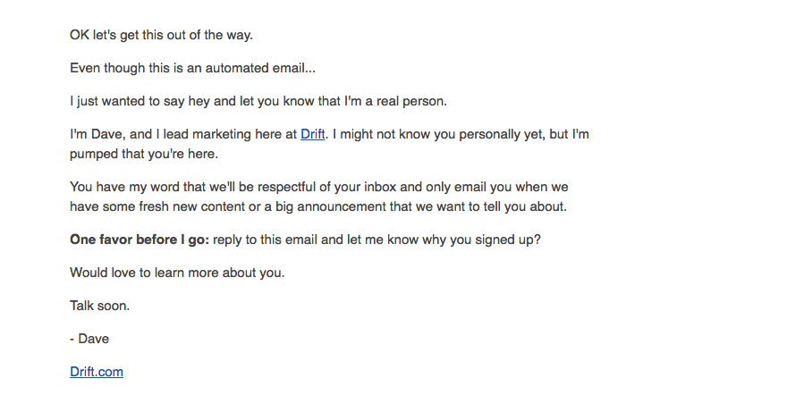
This welcome email to the newsletter subscribers sounds more human than many actual humans.
Yes, your customers are well-aware that the emails are automated. But no, it doesn’t have to sound like a C-3PO.
You can see how Drift’s email message offers a sense of comfort to the readers – a feeling that they just received an email from Dave himself, and that he actually cares about the subscriber and what they have to say. And mind you, this isn’t their first version – they had their fair share of email marketing eureka moments before crafting these beauties.
Tip: As much as possible, avoid sending emails from addresses like “sales@xyz.com,” or god forbid, “no-reply@abc.com.”
The same applies to the From name – “Josh from ABC” sounds more welcoming than “ABC Reminder.” A little number to back that up – about 68% Americans claim that their decision to open an email is based on the From name.
3. Stand true to one, consistent voice.
Every single piece of communication you send is a representation of your brand. When a company’s voice regularly changes, it can be hard for customers to get a handle on what you’re about.
Creating a consistent customer experience and voice across all platforms has been shown to drive revenue increases of up to 23%.
Take a look at this example from The Hustle:
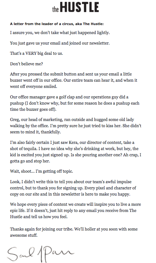
The subject line of this email? “Look what you did, you little jerk…”
Now your emails sound more human. Great! The next step – make them look like they’re from a single human.
For starters, try and ask yourself these two questions:
- If your brand were a person, who would they be?
- If you remove your logo and company name from your emails, will the readers be able to identify that the emails are from you?
By being everything to everyone you’re nothing to anyone.
Give your emails a personality. According to Brad Abrams, Google Assistant’s group platform manager, those conversational bots with the strongest personas had the best retention rates. Abrams’ team even has a persona sheet in place, that lists down all the phrases that their bots should and shouldn’t use.
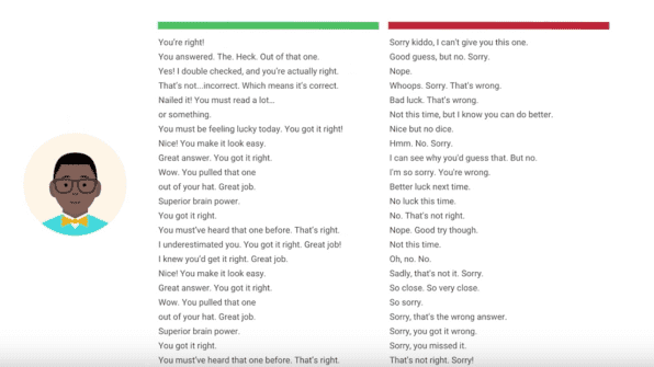
Google’s persona sheet. When a bot becomes a person. Image Source
Hustle’s newsletter is meant for millennials, and the emails reflect that. The voice is casual, no-holds-barred, chatty, with zero jargons and pretensions. And the best part? This stays consistent across all their channels.
There’s a reason this is so powerful. When consumers are asked why some brands stand out more than others, a massive 33% believe it comes down to having a distinct brand personality.
4. Smile. Show some love.
A major challenge for growing companies is this: 71% of customers say that personalized user experiences are what influence their choice to interact with emails (or not).
The cause of this problem is that marketers are trying to automate everything, for obvious reasons. You simply can’t write a fully personalized email to every customer every time you need to get some comms out.
How do you still make your customers feel special then?
Here’s how Buffer does it:
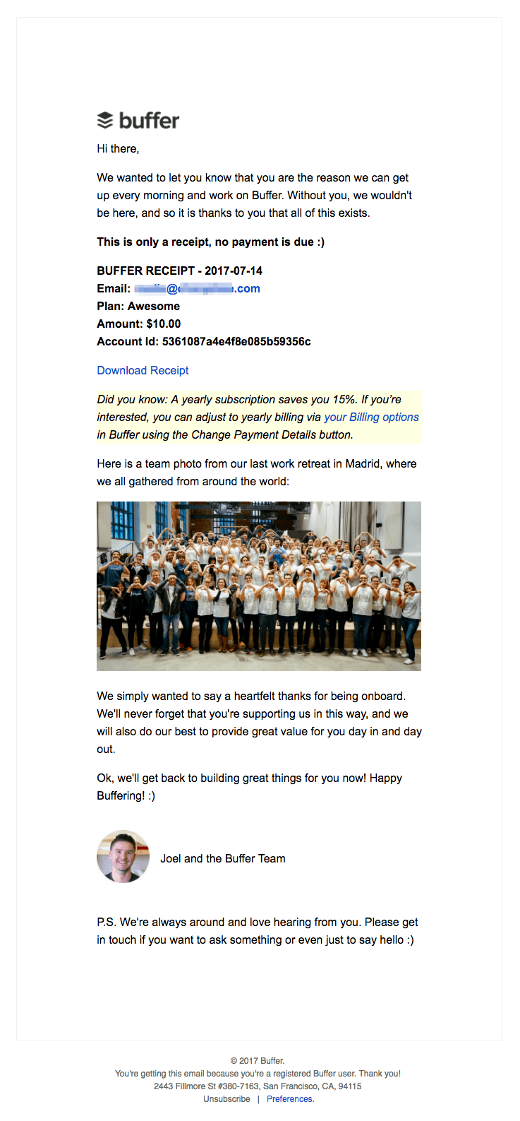
That warm fuzzy feeling you get when you read this email.
Your customers have made a choice. A choice to shake hands with you and get associated with you, and not with your competitor across the street.
And you should make sure that they know much you appreciate that choice. In every chance you get. In every channel you can get into.
Including your transactional emails. Make them feel special. Reward them for their relationship with you, and show them that you’re glad that they’re reading that email at that moment in time.
I’ve learned that people will forget what you said, people will forget what you did, but people will never forget how you made them feel.
Buffer does this phenomenally well. Just the subject line, “Thanks for your payment. You are making Buffer possible! :-)” is enough to make any customer feel special. And it probably would’ve taken them about 10-15 minutes to create that.
Birchbox clearly knows that 80% of customers are more likely to buy from a brand that offers a personalized experience.
That’s why they send an exclusive discount coupon to their customers on their birthdays. In this day and age — where most of us need social media to remind us of our loved ones’ birthdays — who wouldn’t fall in love with such a sweet gesture?
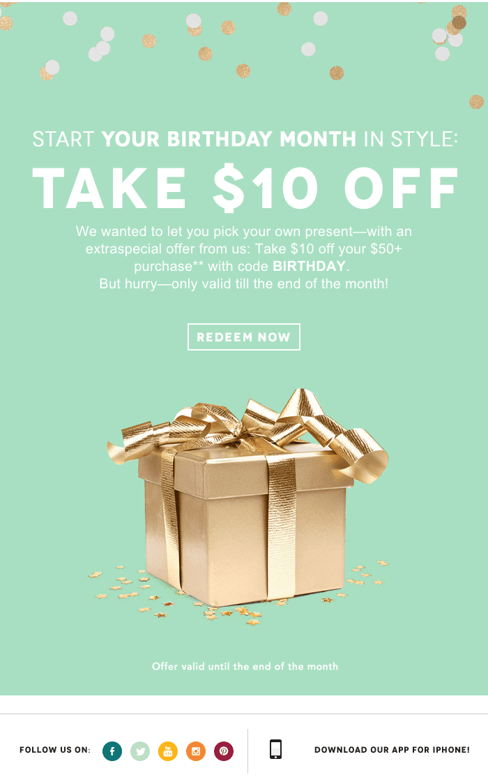
Happy email to you!
5. Save their time, effort, and energy.
Want your customers to stick around? Then make their lives easy.
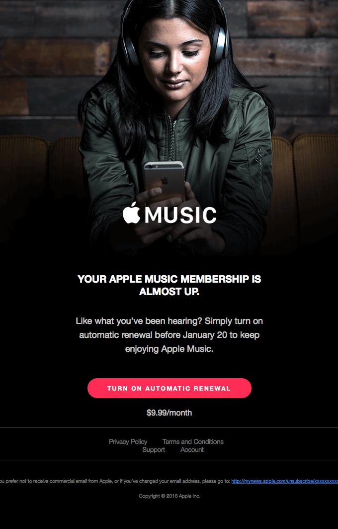
1.05 seconds. That’s how long it will take to get the crux of this email.
Us humans currently sport an attention span of 8 seconds, which is apparently less than that of a goldfish.
8 seconds is all you’ve got to get the point across in your email.
Apart from apps that filter out emails based on their urgency and importance, how can we, as senders of those emails, be more empathetic and make our emails sensitive to the recipient’s state of mind and productivity?
First off, have just one single purpose for each email. Your subject line, your body content, and your CTAs should be centered around that goal. Kill everything else that might distract the reader.
Have one clear call-to-action. Avoid using friction words (like Download, Apply, Order, Submit) in your CTAs. Use benefit-focused terms instead. If you’re sending an email that contain information which is critical, like the failure of a payment, send the email at a time that’s convenient for the customer, and not real-time when the payment actually fails.
Try to keep your CTAs button-based – they lift click-through by 127%.
Ensure that your emails load faster. Include a neat plain-text version of your emails that don’t have many differences from your HTML version. If you have image-heavy HTML emails, make them basic or rich text as much as possible. Add ALT texts to the images. Have your main CTA render without an image.
Assume that most of your readers will not have the images displayed. Switch seamlessly between platforms. See to it that your emails look just as gorgeous and smart on mobile as well.
Include deep links wherever possible to cut down the number of clicks. Here’s an example:
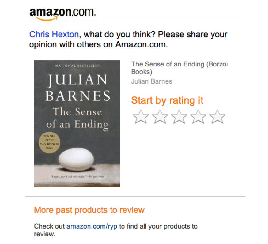
Rate your favorite read without having to leave your inbox? I’m sold!
Take a (second) look at Apple’s email. The image conveys what the product stands for and it fades to black, bringing attention to the heart of the matter, which then takes you to the super-straightforward CTA. As focused as an arrow.
Bonus tip: Make use of Inbox Action buttons that show up on Gmail, if you meet the criteria and if you think that it will make sense for the particular email. It just takes a few lines of code and works wonders in saving your customer’s time and effort.

Simple interactions that save a couple of extra clicks. Image Source
6. Stick up for them. Side with them.
Building a personal relationship with your customers should be a high priority for sales and service teams. Two-thirds of lost accounts are due to poor customer contact and relationship building, so it’s definitely a place to put your focus if you’re trying to reduce churn.
If HubSpot, who are sending hundreds of thousands of emails every month, can do it, then so can you:
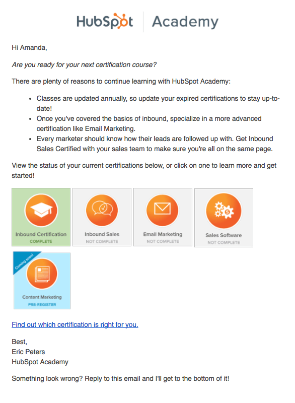
HubSpot Academy is rooting for Amanda, alright.
Personalize the experience. Unlike cold marketing emails, in the case of transactional emails already sitting on a goldmine of information about the recipients. And the least you could do is to address them by their first names, set the time stamp to reflect their corresponding time zones, and share information that makes sense for them.
(Note: Including the customer’s first name in the subject line has its own set of benefits. PadiAct saw an uptick of 5% in opens and 17% in click-throughs in a month, just by adding the name in the subject line.)
HubSpot goes one step further in the personalization game. With the help of Smart CTAs, their emails display the various courses that are available to the customer, along with the status of each course.
Segment the customers. And include links to helpful articles and guides that will resonate with that particular segment. Say something about a new feature update that might help that specific group.
Send relevant emails. Notice that a customer hasn’t used your app for a considerable time, send them a “Is everything alright?” email instead of a generic activity summary.
Connect with them. Ask them questions. Let them know that you’re eagerly waiting on the other end of the line to listen to what they have in mind. And make sure that they don’t have to jump through hoops to get your attention. Give them links to pages (like FAQs, track your order, customer forums, etc.) that might come in handy when they have a question.
7. Sell.
Hey, just because your emails need to be simple, human-like, and friendly doesn’t mean you can’t still sell your stuff.
Email has long been a favorite tool of marketers, with return on investment being in the range of $42 for every dollar spent.
Here’s an example, from Skillshare, of an email that sells (without being salesy):

Smooth, non-pushy, personalized cross-selling. Skillshare gets it.
As we discussed in the introduction, you’re leaving a lot of cash on the table by not taking advantage of your transactional emails. In fact, segmented, targeted, personalized emails generate 58% of all revenues from email.
Recommend products related to their purchase history, cross-sell add-ons, up-sell higher-tier plans. Have a healthy mix of recommendations that dynamically change for each customer and hard-coded suggestions.
Give them options to refer new customers or to give you a shout out on social media. Give them good reasons to do so, with referral bonus or benefit-focused promotional offers.
Follow the 80:20 rule – 80% transactional information, 20% promotional content. Design your email in such a way that the promotional information takes a back seat (even your subject line should only talk about the transaction). Keep in mind that whatever is said and done, it’s a transactional email, and its primary objective is to inform your customer about an event.
Even a shipping confirmation email can be used to subtly upsell another product.
8. Steer clear of the spam folder.
All that hard work crafting a witty, on-brand email with button-based CTAs and a smooth, soft sell, and then what?
You get yourself landed in the spam folder.
It’s every marketer’s worst nightmare, but around 6% of legitimate sales and marketing emails get marked as spam. Often, it’s a promotional email or email newsletter that uses a word known to trigger spam filters.
And look, it makes sense. Only 55% of emails sent are actually what they say they are. The rest are spam. So those filters are there for a reason.
If a tree falls in a forest and no one is around to hear it, does it make a sound?
Here are a few pointers to ensure that this doesn’t happen:
- Avoid the use of spam trigger words
- Use a reliable email service provider (ESP)
- Avoid sleazy practices like using “Re:” or “Fwd:” in subject lines
- Use trustworthy From field names (“josh@xyz.com” instead of “543gh@xyz.com”). Send relevant, solicited emails using those addresses to boost their reputation.
Conclusion
With these eight slick tips under your belt, you should be crafting effective transactional emails in no time.
Here’s a quick recap on what we covered:
- Keep your emails short and simple
- Try to sound like an actual human being
- Make sure your tone of voice is consistent
- Be friendly, show a bit of love
- Make your customers’ lives easy
- Get on their side and make a connection
- Use your transactional emails to SELL
- Do whatever you can to avoid the spam box
Lastly, get yourself a robust transactional email service to help you send them.
Create and send beautiful transactional emails. To the right people. At the right time. With little effort. Sign up here.
Before we conclude, here’s a transactional emails-version of Isaac Asimov’s Three Laws of Robotics:
- A transactional email may not cause inconvenience to a recipient or, through inaction, allow a human being to suffer a disadvantage.
- A transactional email must obey orders given to it by recipients (“don’t remind me again”, “unsubscribe me from this list”) except where such orders would conflict with the First Law (in which case, a double opt-in should be in order).
- A transactional email must accomplish its main objective (informing the recipients about something/getting them to perform an action), as long as the objective does not conflict with the First or Second Law.
Create and send beautiful transactional emails. To the right people. At the right time. With little effort. Join the waitlist.
