One of the biggest challenges for an ecommerce store is converting visitors into actual buyers. Your checkout page is a major deciding factor in making that happen on your ecommerce site. The checkout experience is also impacting customer satisfaction and, thus, how likely they are to return.
But there’s one thing that stands in the way: cart abandonment. The average documented shopping cart abandonment rate is a whopping 69.8%. So while it’s true that most people love online shopping, why do so many of them abandon their quest mid-way? It turns out; there are multiple reasons why:
- Hidden costs, such as shipping costs that are not mentioned upfront
- Forced to create an account
- A complicated and lengthy checkout process
- Insufficient payment methods
Moreover, if you are offering ecommerce subscription services, customers expect more flexibility in the subscription duration, the ability to cancel any time, and an option to add-on products with subscriptions. Lack of these can also result in cart abandonment.
Cart abandonment indicates lost revenue and hence impacts your bottom line. While you cannot completely avoid cart abandonment, you can certainly follow some best practices to enhance the checkout experience and achieve higher conversion rates.
In this article, I am going to enlist some of the checkout best practices along with examples. It’s an exhaustive list, so feel free to jump to the section that interests you most:
- Keep it simple
- Single page checkout
- Guest checkout
- Smart form filling
- Think global
- Multiple currencies and payment gateways
- Multiple languages
- Global tax support
- Get the best out of your checkout
- Make upselling easy
- Exit-intent popups
- Build trust
- Add customer testimonials
- Give easy access to support
- Make it convenient and flexible
- Multiple payment options
- Optimize for mobile view
- Offer one-time purchases and subscriptions checkout
- Don’t forget about security and privacy
- Comply with security guidelines like SSL and PCI
- Comply with CCPA, GDPR, and MFA standards
- Test and test again
- A/B testing
These best practices are sure to bump up the conversion rate optimization of your online store. So let’s jump right in!
#1 Keep it Simple
This goes without saying, but I will say it anyway: Keeping your checkout flow as uncomplicated as possible goes a long way in optimizing conversions. To make your checkout as distraction-free as possible, you can consider removing the header and footer at checkout, as they might pull the user away from multiple buttons and options.
Some of the sources of friction in the checkout flow include painfully long forms with too many form fields and forced account creation or sign up. You must remove all possible friction from the checkout process to ensure it is seamless and easy. After all, you don’t want to scare away a visitor by giving them a tough time while checking out.
Here are some ways to ensure a simple and seamless user experience:
1.1 Try a Single Page Checkout
While there are pros and cons of having a single page vs. a multi-page checkout, One-page checkouts are certainly the simpler option of the two from a user’s perspective. In a single page checkout, all the steps are displayed on one page, requiring minimum navigation.
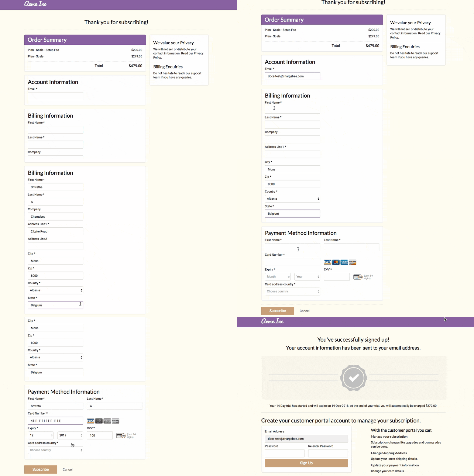
Single page checkout can help users fill out the information in one go without distractions, which brings us to our next point. Customers often want custom delivery options and a choice of shipping methods. This can be added to your one-page checkout as well.
Since all the information is packed on a single page, it may seem lengthy. To tackle this, you can add a progress indicator in the one-page checkout, marking mini-milestones that the user has completed.
1.2 Enable Smart Form Filling
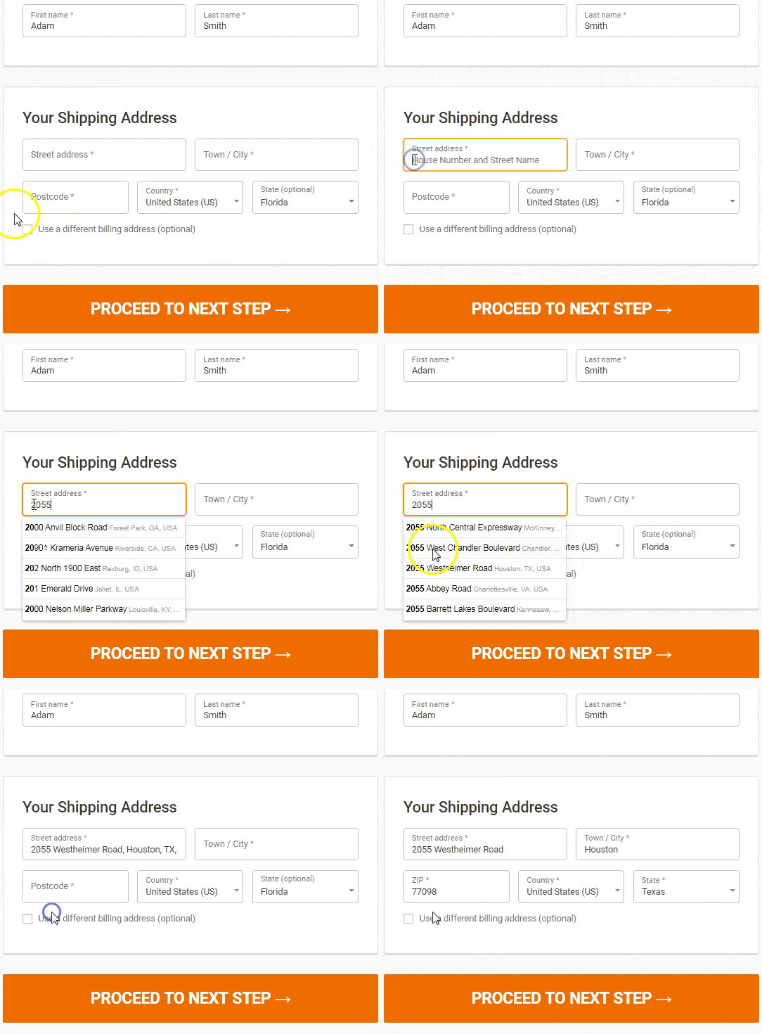
Form filling is an exercise that can’t be avoided in the checkout process, so why not make it as easy as possible? Smart Checkout form filling includes using shipping address predictor tools or autofill options such as Google Autofill. It also helps to have form field validation and error notifications to spot errors on the go. For the billing address, enable a radio button or small check-box to enable users to select the same address as the shipping address. These tools make form filling an efficient, quick, and error-free activity.
(Source)
1.3 Allow Guest Checkout
More often than not, customers just want to make a purchase and move on with their lives quickly. The worst thing that can happen in such scenarios is making them sign up/create an account for the purchase. This becomes a point of friction and leads to abandoned carts. It’s best to allow users to checkout as a guest to enter the minimum required information quickly, head straight to payment, and finish the purchase before changing their minds.
#2 Think Global
For an ecommerce website serving customers in multiple countries, it’s crucial to think about localizing your checkout experience. Localized checkout experience has a higher chance of converting because it further removes any barriers users may have. Here’s how you can do so:
2.1 Support Multiple Currencies and Payment Gateways
Instead of currency conversion options, allow users to opt for the currency they prefer. Currency conversions add an extra cost for the user, which could be an added source of friction. It is also essential to support multiple payment gateways, especially the ones that support global transactions. This ensures a seamless and localized payment experience for the user.
2.2 Support Global Tax Guidelines
With global transactions come taxes. Tax requirements differ from country to country. Therefore, it is important to calculate international taxes based on the user’s location dynamically to provide a frictionless checkout.
2.3 Support Multiple Languages
Hola! Que Tal?
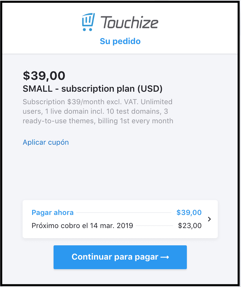
Confused? (that’s Spanish for “Hello, what’s up,” btw) So are many online shoppers when they are not comfortable with English. Removing the language barrier by supporting multilingual checkout is the cherry on the top of a cake – the beautifully localized cake. Here’s an example of a checkout that talks to the customers in their local language.
#3 Get the Best Out of Your Checkout
What else can you do to increase conversions on your ecommerce website? Leave no stone unturned and take all steps possible to ensure that an online shopper goes from “maybe” to “proceed to checkout”. Here are some ways you can do that:
3.1 Make Upsells Easy
Upsells are a great way to tempt the user to buy more. But be warned, too many upsell options can hamper the UX and make it too distracting. Take a look at how Superfoods makes upsells accessible:
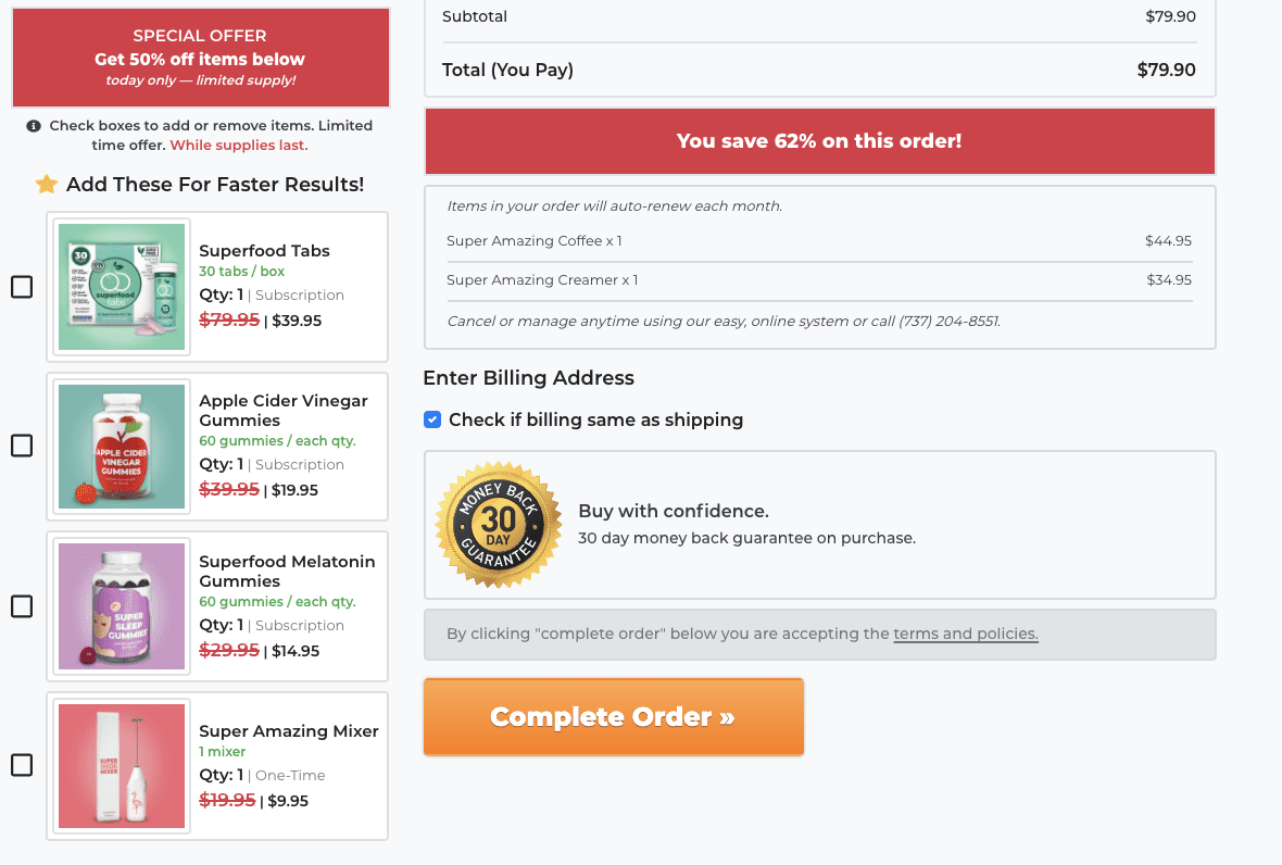
They make adding additional items to the cart enticing with limited period offers. They make it very easy with the checkbox buttons. Also, note the combination subscriptions and one-time purchases in the suggested items.
3.2 Exit Intent Pop-ups
Exit intent pop-ups serve as a last ditch effort to entice a leaving customer. You can do that with some clever copy or discounts. Adding limited-time promo codes on the exit to encourage them back to the purchase. If they decide to leave anyway, you can give them an option to sign up for updates or newsletters.
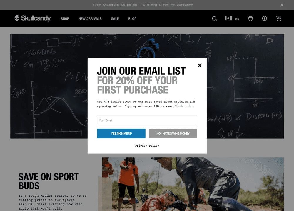
Superfoods Company has implemented another way to minimize cart abandonment using pop ups. They display a pop up promising free goodies users to finish checkout within 5 minutes. Clever, isn’t it?

#4 Build Trust
Customers in doubt may need assurance about the product, support, or even the security of the transaction. There are many ways you can build trust:
4.1 Add Customer Testimonials
Customer testimonials are a great way to reassure a customer who is still unsure at the checkout step. Testimonials or case studies with positive reviews will help reinforce their beliefs and reduce the risk of abandoned carts.
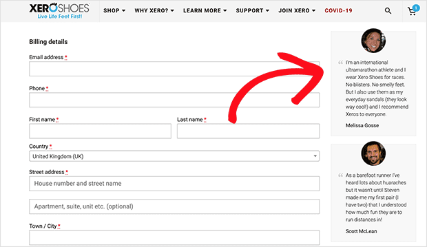
4.2 Give Easy Access to Support
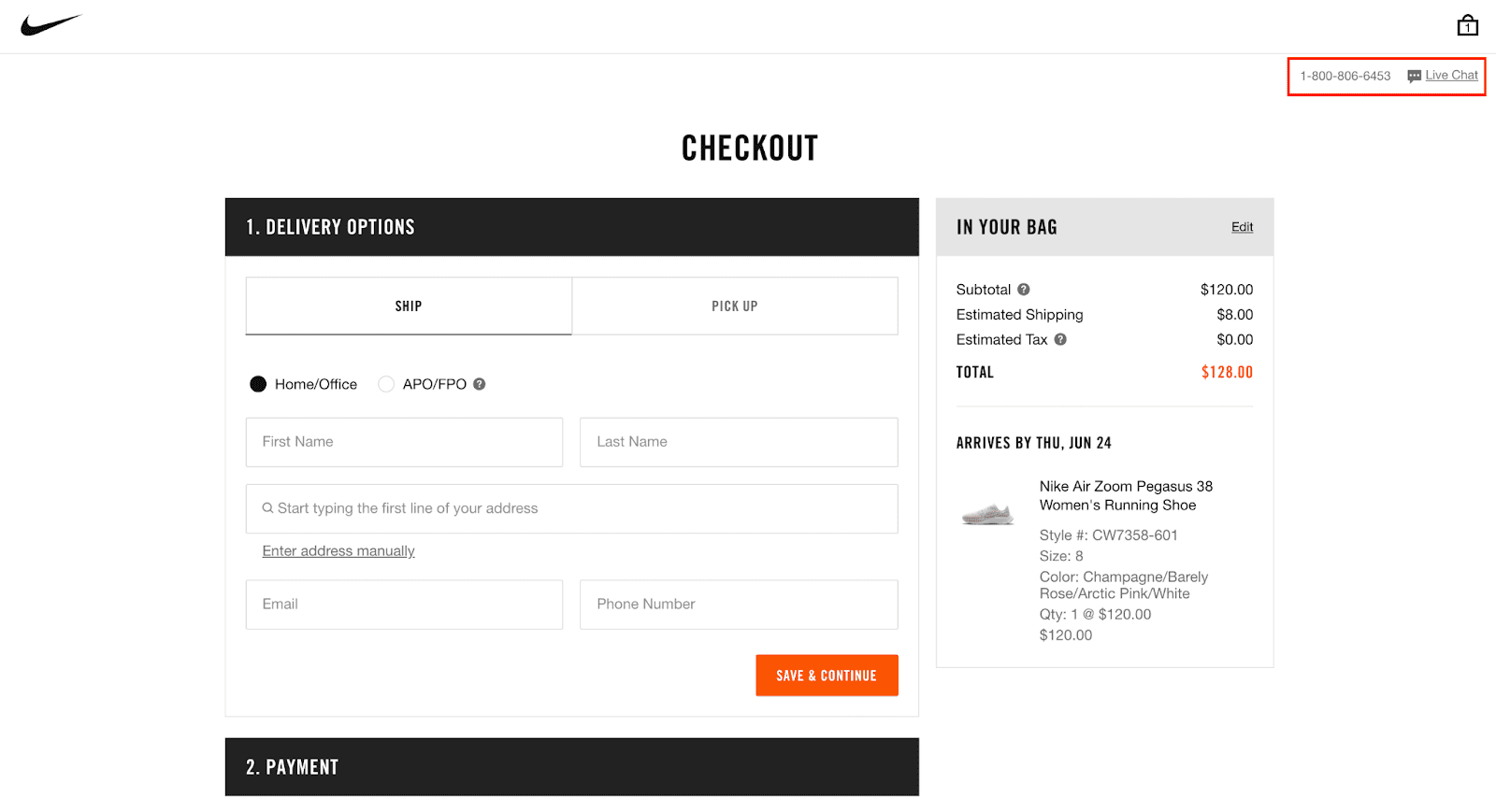
This is another way to reassure customers that help is available at their fingertips, should they need it. This can be done by enabling a live chat option at checkout. Check out Nike’s checkout, which provides a support phone number and live chat for easy access.
#5 Make it Convenient and Flexible
You have to make it hard for potential customers to leave your online store for another. There are quite a few ways this can be done, by making the purchase process convenient and giving the customers flexibility:
5.1 Multiple Payment Options
One of the most commonly documented reasons for cart abandonment is the unavailability of preferred payment methods. Payment choices differ from country to country. While credit cards are widely used in some regions, consumers in certain parts of the world may feel less secure using them. Spoil your customers by giving them multiple payment options such as PayPal, Amazon Pay, or Apple Pay to nudge them to follow through with the purchase. It is helpful to work with an ecommerce and billing platform with integrations to all popular payment options.
Did you know that Chargebee supports 30+ payment gateways and 20+ payment modes?
5.2 Optimize for Mobile View
Mobile ecommerce sales are soaring and are projected to hit $3.56 trillion in 2021; that’s 22.3% growth YoY. Not optimizing your ecommerce checkout for mobile devices would mean leaving money on the table. Instead, ensure that the mobile checkout is just as seamless and test the CTAs on checkout buttons for functionality and effectiveness.
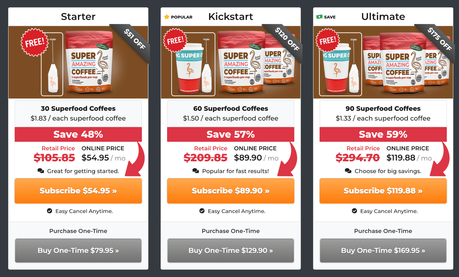
5.3 Offer One-time Purchases and Subscriptions Checkout
If you offer subscriptions for ecommerce business (and if not, here are some reasons you should consider it), you can provide both one-time purchases and subscriptions so that customers have the flexibility to choose. Here’s how Superfoods company does it:
#6 Don’t Forget About Security and Privacy
Security and privacy concerns are important aspects of online shopping. Some customers may pay a lot of attention to how secure they feel the transaction is. Complying with security and privacy regulations is essential to operating in certain regions with specific guidelines. Displaying these security certifications or trust seals at checkout also breathes confidence in the concerned customer.
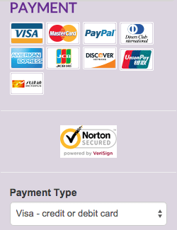
Here are some specific security and privacy regulations:
6.1 Comply with security guidelines like SSL and PCI
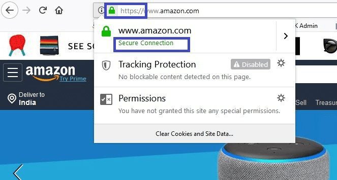
It begins with getting a Secure Sockets Layer (SSL) certificate for your ecommerce website to provide a secure connection and encrypt credit card information. Complying with PCI DSS (Payment Card Industry Data Security Standard) is also necessary for protecting card information and secure payments.
6.2 Comply with CCPA, GDPR, and MFA standards
CCPA (California Consumer Privacy Act) and GDPR (General Data Privacy Regulation) are data privacy guidelines for storing sensitive information you collect from customers, such as their phone numbers, credit card information, shipping address, email address, etc. Additionally, MFA (Multifactor authentication) standards add additional security over the username and password login.
#7 Test and Test Again
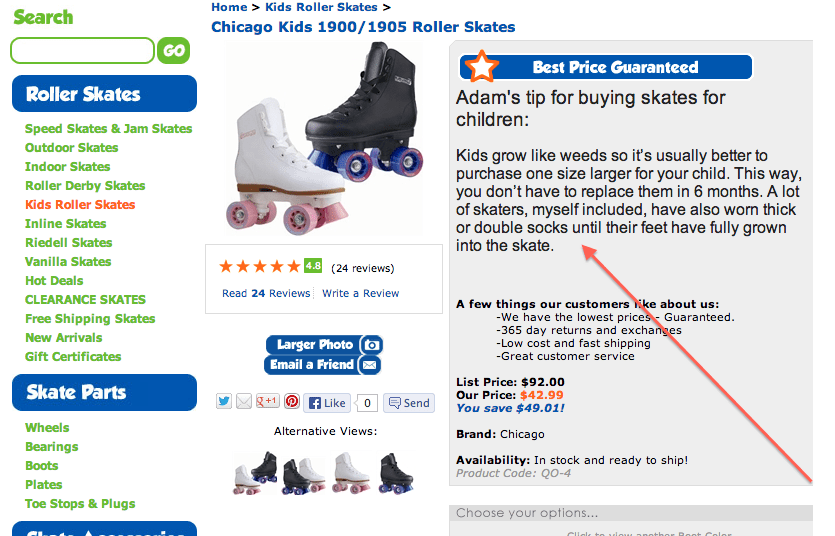
There are so many ways to optimize the checkout experience for your ecommerce store. As an ecommerce retailer, you need to always focus on designing your checkout and experiment continually. The only way to ensure you are getting the best out of it is to test everything from the placement of the CTA to rearranging the images on the checkout design on an ongoing basis. Here’s an example of two variations of a checkout:
Wrapping Up
The checkout process arguably the most crucial cogwheel of the buying process, so continually optimizing it will be worth it in the long run. Making the checkout experience better is a long and ongoing process, and these best practices will help you get things started and then experiment more to find what works for you.
Here’s how Chargebee enables the smoothest checkout experience.
