The important thing is to never stop questioning
Blindly following the industry trends is pointless, as we’re all unique snowflakes.
In the 2006 model year, Porsche came up with Cayman, a coupé based on their convertible, Boxster.
The German carmaker’s uncompromising standards ensured that the product was impeccable. And it was time for the team to tackle the next big question – how much should we sell it for?
The market data was clear-cut – all coupés were priced 7 to 11% less than their convertible counterparts. With the Boxster costing around €52,265, the industry standard pinned Cayman at a price point of around €47,000. A no-brainer, they felt.
But Wendelin Wiedeking, the then CEO of Porsche, had other plans.
To give you a bit of background, Wiedeking assumed his role as the CEO in 1993, when Porsche was close to bankruptcy and was declared to be unfit to survive on its own by analysts.
And within two years, he turned the tables with his dynamic guidance, kicked off Porsche’s rise to fame. He’s often called the Saviour of Porsche, for the right reasons.
He wasn’t fond of going behind the industry norms and instead wanted to dive explore the value-based pricing philosophy.
With the help of Simon-Kucher & Partners, a German consulting firm, they carried out an extensive global research.
And the results were worth the effort indeed – they indicated that Cayman should be priced, not 10% cheaper, but rather 10% costlier than Boxster, as the consumers were found to value the former more than the latter.
Wiedeking’s team nodded, smiled, and went ahead and launched the coupé for €58,529. And as expected, it won over the audience.
Unless you are willing to go beyond the existing notions and dig more into the value that your customers find in your offering, you will not be able to get your pricing strategy on point.
Here is an exhaustive teardown of how three well-known SaaS players test, learn, repeat, and ace their pricing games.
(All hail WayBack Machine!)
Shopify – Let your product dictate your price:
Shopify is often perceived as the new kid on the block who struck gold on its very first foray and massively scaled in no time.
When in fact, the team has been building the product for over the past 15 years.
It all began in 2004 when the founders wanted to open an online store for snowboarding equipment. Unimpressed with the prevailing e-commerce products, they decided to build their own store. Two years later, Shopify was launched.
The team refused to scale and focussed heads-down on perfecting their product, up until 2011. They were one of the earliest contributors to the Ruby on Rails framework, and even built an open source payment gateway plugin using it.
Later on, with Stripe out in the market, Shopify latched on to the Stripe ecosystem, post which Shopify payments came into being.
And amidst all these changes, the product was slowly getting shaped.
Then when they decided to scale around 2011, the team engineered scaling by virtue of brilliant onboarding – they ensured that their product solved a problem for almost everyone in the market.
Along with their scaling efforts related to the product, you’ll find the Shopify team having intricately woven their pricing experiments, through every stage of the product’s evolution.
Right from the changes in value metrics (storage limits, transactions fees, credit card charges, feature-based differentiation), to the introduction and removal of new pricing sections (Sell online, Sell in person), every revision of their pricing has been closely coupled to the development of their product, and consequently, the value derived by the customer.
(Side Note: If you take a trip back down their pricing history, you’ll begin to see rapid iterations in pricing precisely around 2011, when they had shifted their focus on scaling.)
And all these activities helped the team in notching up their scale, eventually leading to an unstoppable growth snowball.
Presenting to you, Shopify’s pricing journey, and what we can learn from it.
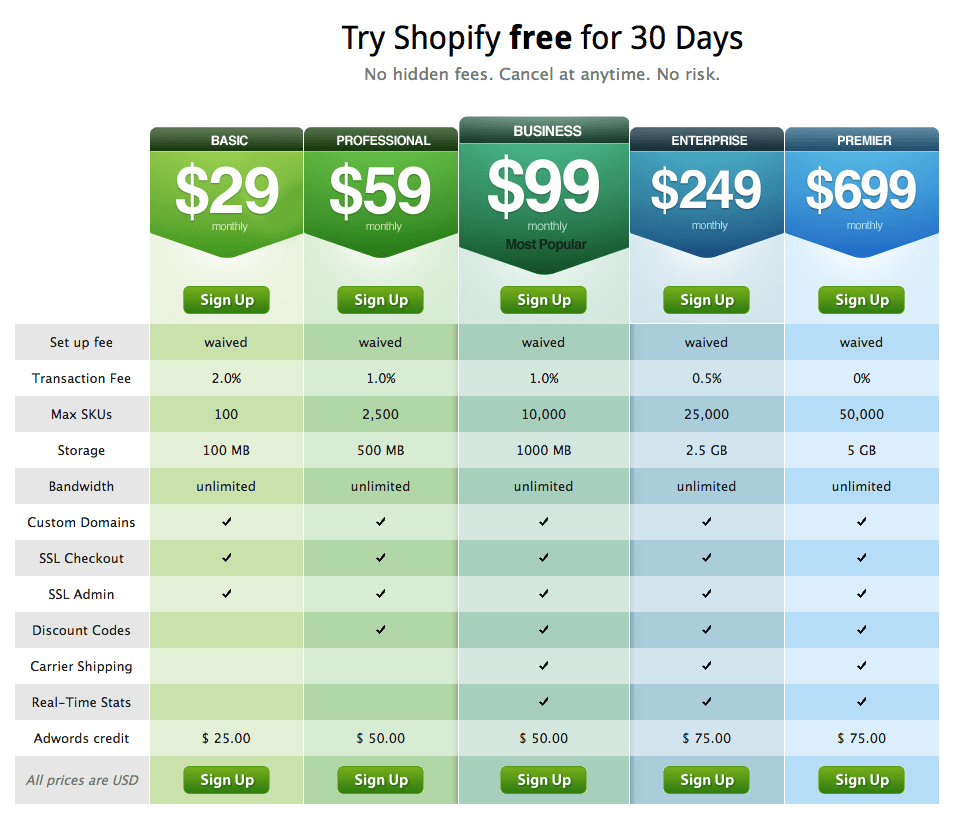
2011:
2012:
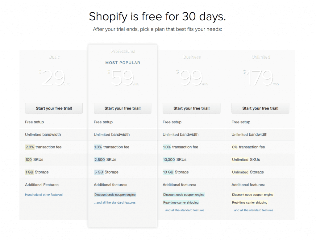
The Unlimited plan replaced the Enterprise and Premier plans, with unlimited SKUs and storage. The storage limit was increased for the other plans as well.
Shopify seemed to have attempted to amp up the appeal and draw more attention to their highest tier plan.
2013:
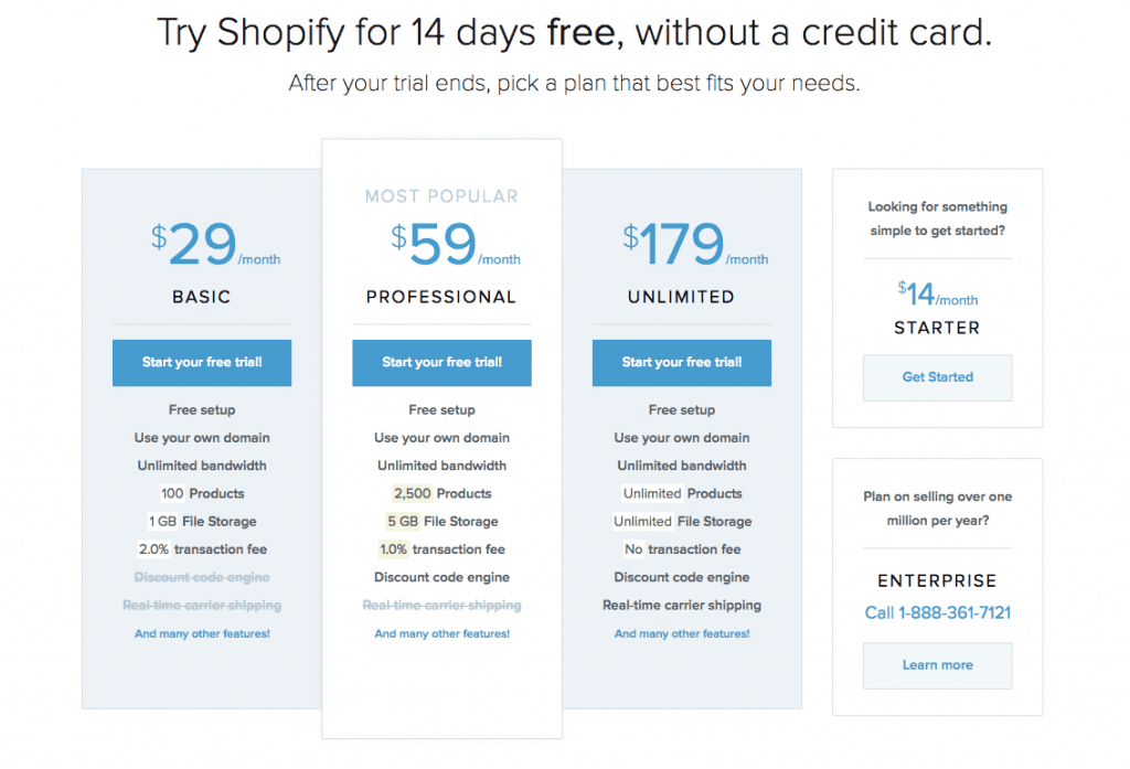
The credit card requirement for the free trial was removed, and its period was also reduced to 14 days. The $99 plan was scrapped, and a cheaper Starter plan was introduced for $14.
Shopify reduced all possible frictions in the way of their bottom-tier users, and to push them to start paying them faster – increase the customer’s motivation to engage with your product by shrinking the free trial period, and reducing your Customer Acquisition Cost in the process.
2014:
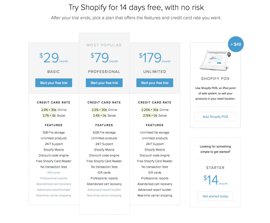
The Professional plan got boosted from $59 to $79. Shopify POS for $49 was launched. Transaction fees were removed for Shopify Payments. The limits on the number of products were also removed. Now, where was the catch in all this, you ask? Credit card rates got introduced.
Shopify had started venturing into the offline commerce waters with these moves. The removal of the transaction fees for Shopify Payments was to cement itself as a one-stop e-commerce shop for small to medium shops, complete with all the payment logistics. (However, as the store grows bigger, the customer would have to pay much more for the credit card processing compared to a third-party solution.)
Early 2015:
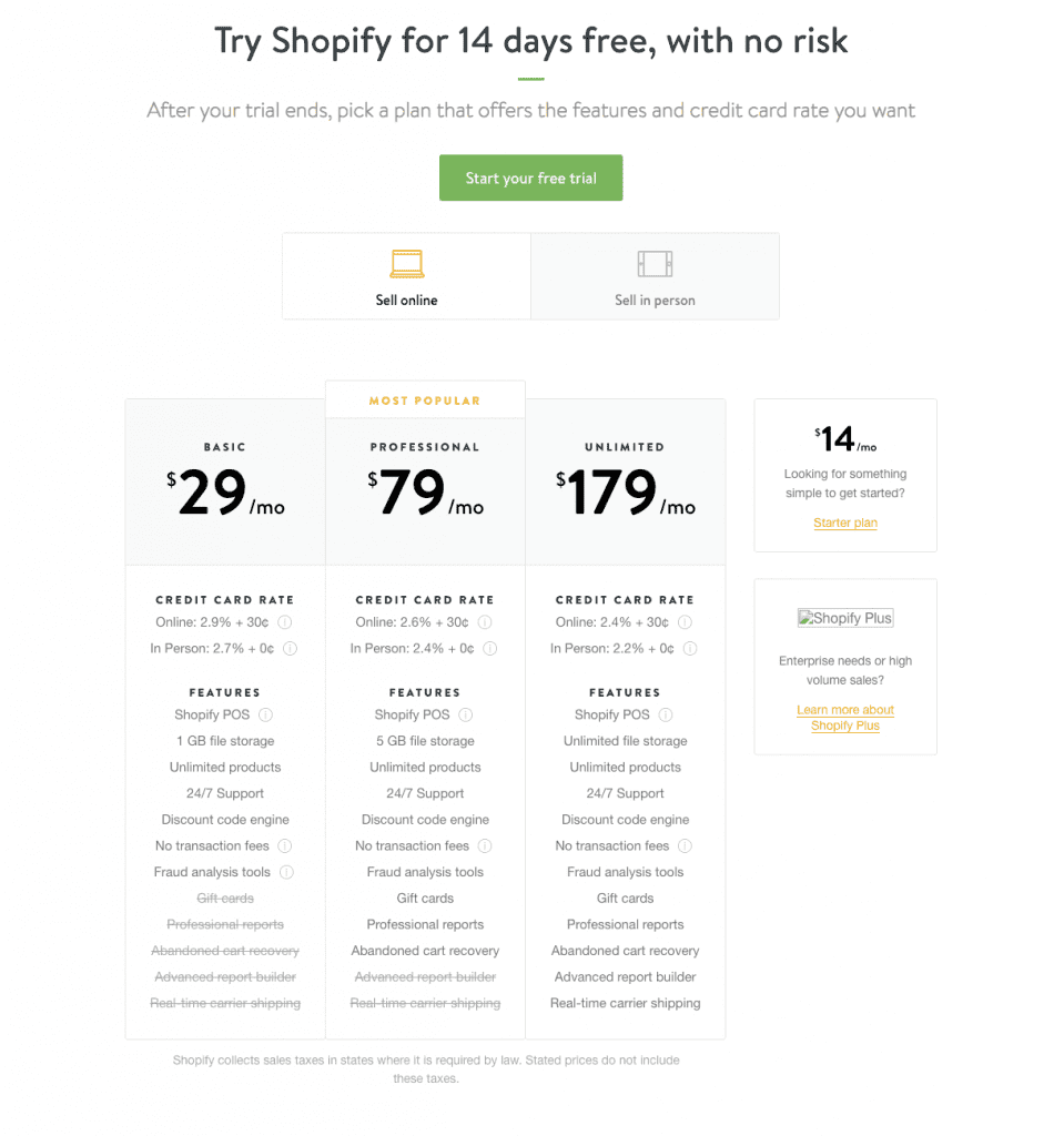
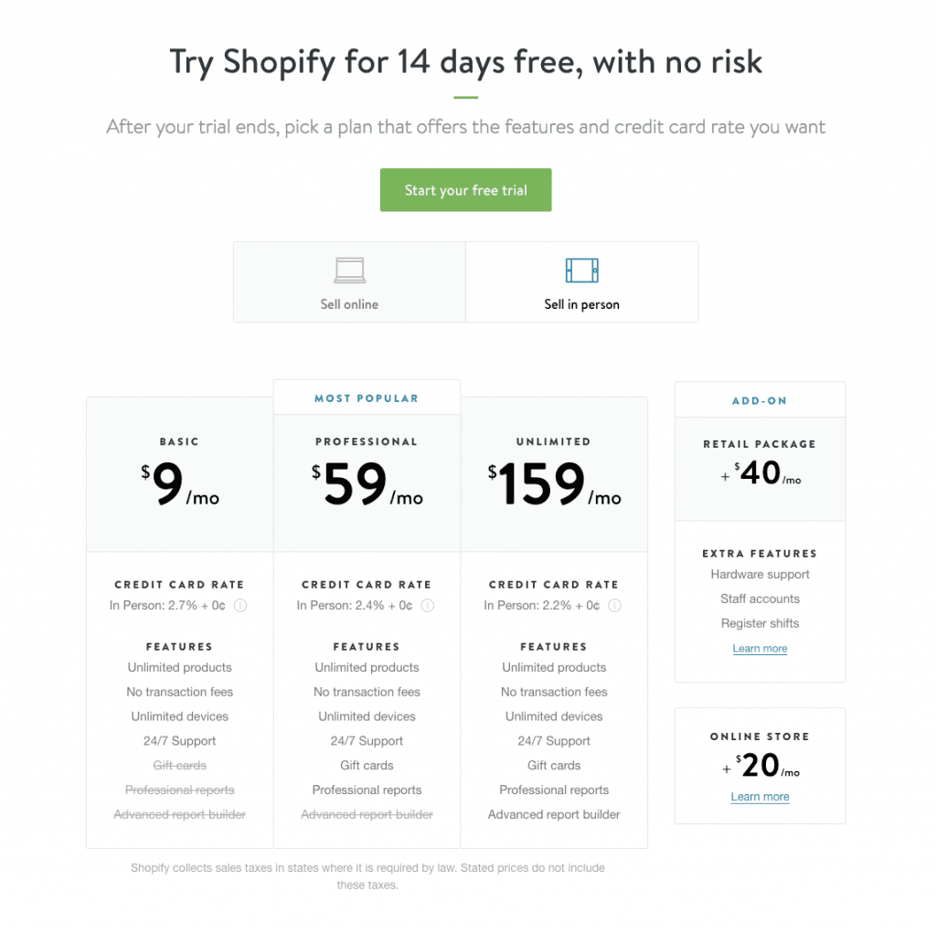
Based on the previous iteration’s results, a brand-new set of plans for offline sellers made its entry. A Retail package was also released as an add-on. Shopify POS got clubbed with the Unlimited plan. Shopify Plus was launched for the enterprise users.
Apart from the hard launch into the offline commerce industry, the Shopify Plus landing page was the most interesting part of this iteration – for a plan that starts around $2000/month, the Shopify team was not even explicit about it, cleverly steered clear of the term “Enterprise”, and just sold the value proposition.
Late 2015:
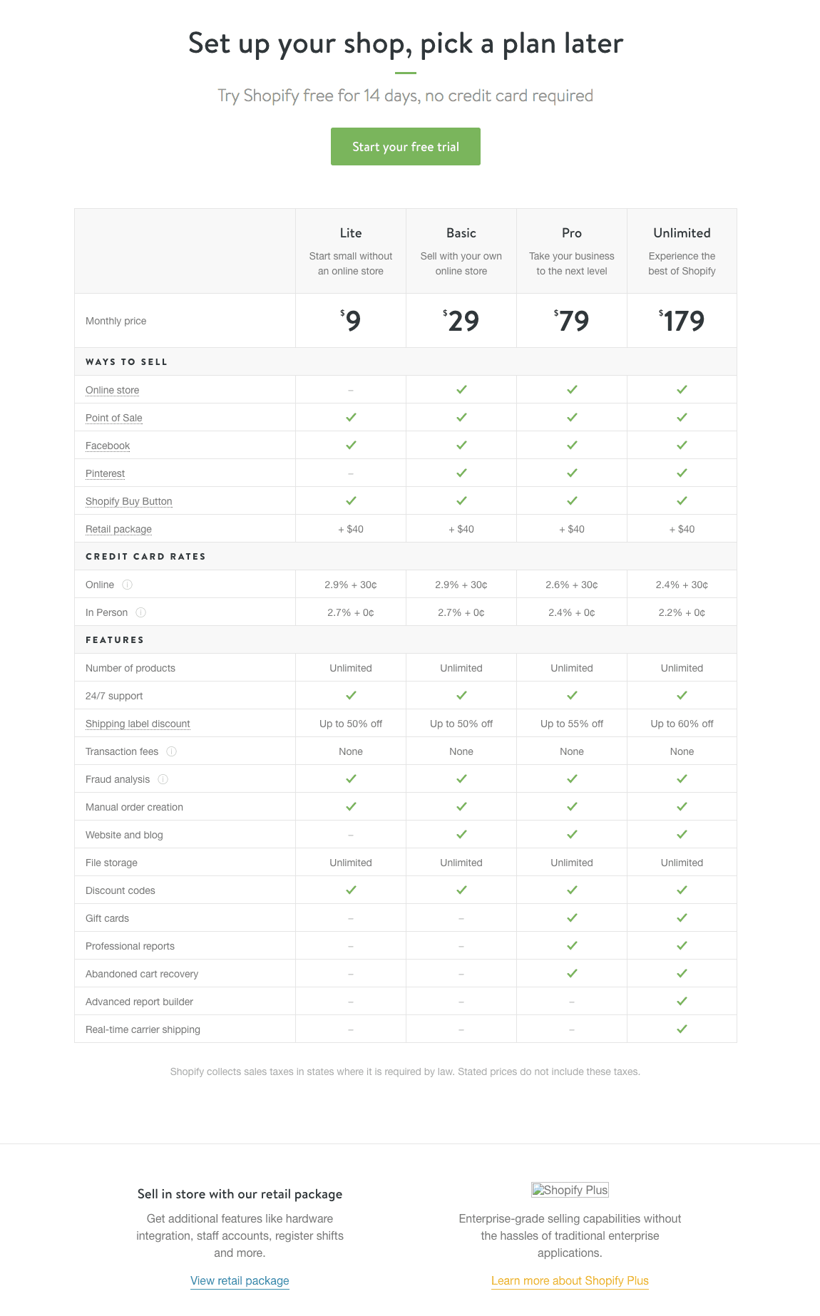
The experiments with offline stores had come to an end. The Starter plan was removed. The two separate sections got clubbed into one single set of tiers starting from $9. Plans no longer had different file storage limits.
Shopify shifted to a purely feature-based pricing model.
2016:
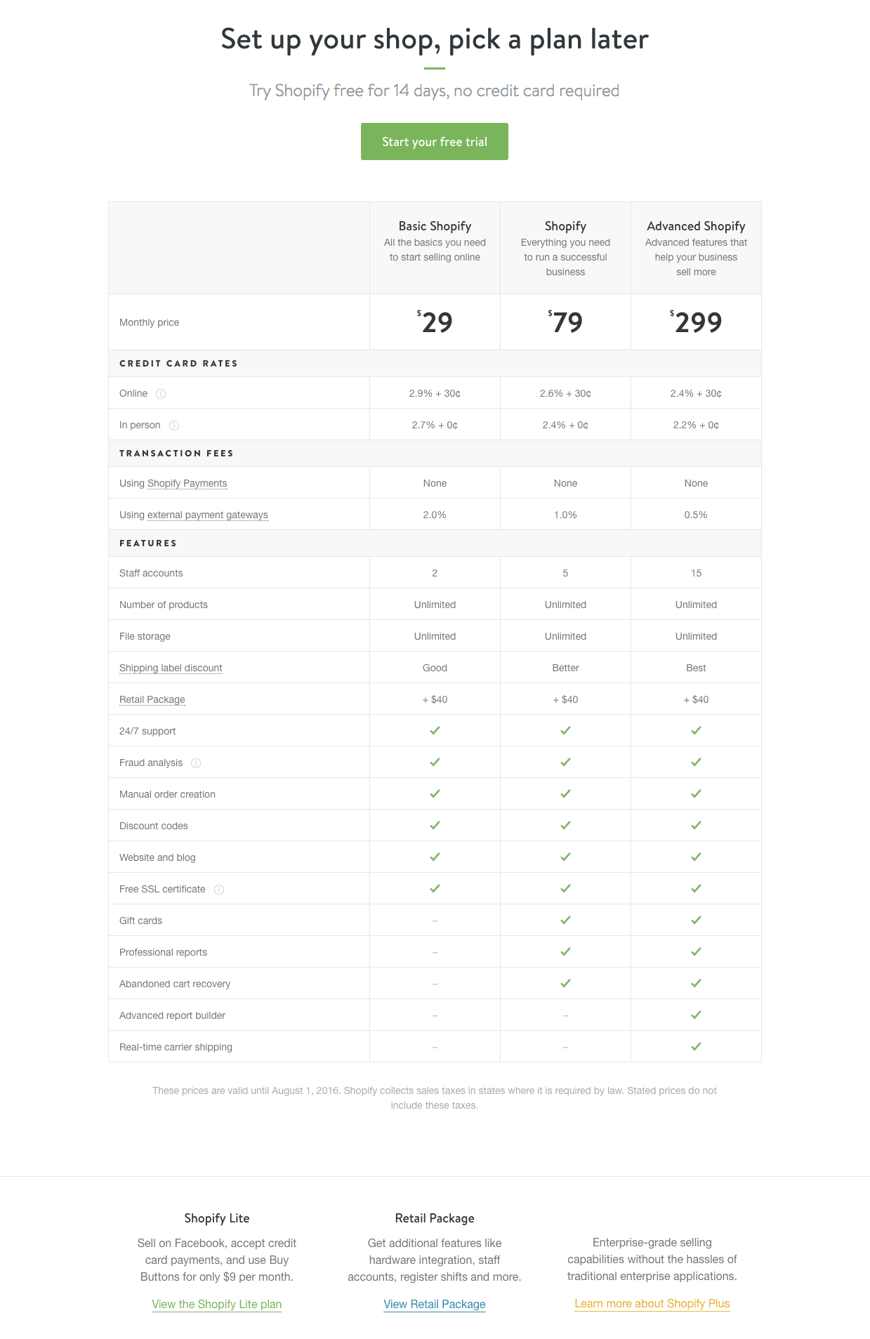
The plan names got revamped. The $179 Unlimited plan evolved into the $299 Advanced Shopify plan. The team once again brought Shopify Payments to the forefront, by charging a transaction fee for external payment gateways. With the new limit introduced on staff accounts, they also spotlighted collaborations as a differentiating factor. (Also note how the Lite plan got pushed to the bottom of the page, making it as inconspicuous as possible.)
Shopify played the price anchoring card in this iteration – boost the price of your highest-tier plan to make your lower plans look more attractive in comparison.
2017:
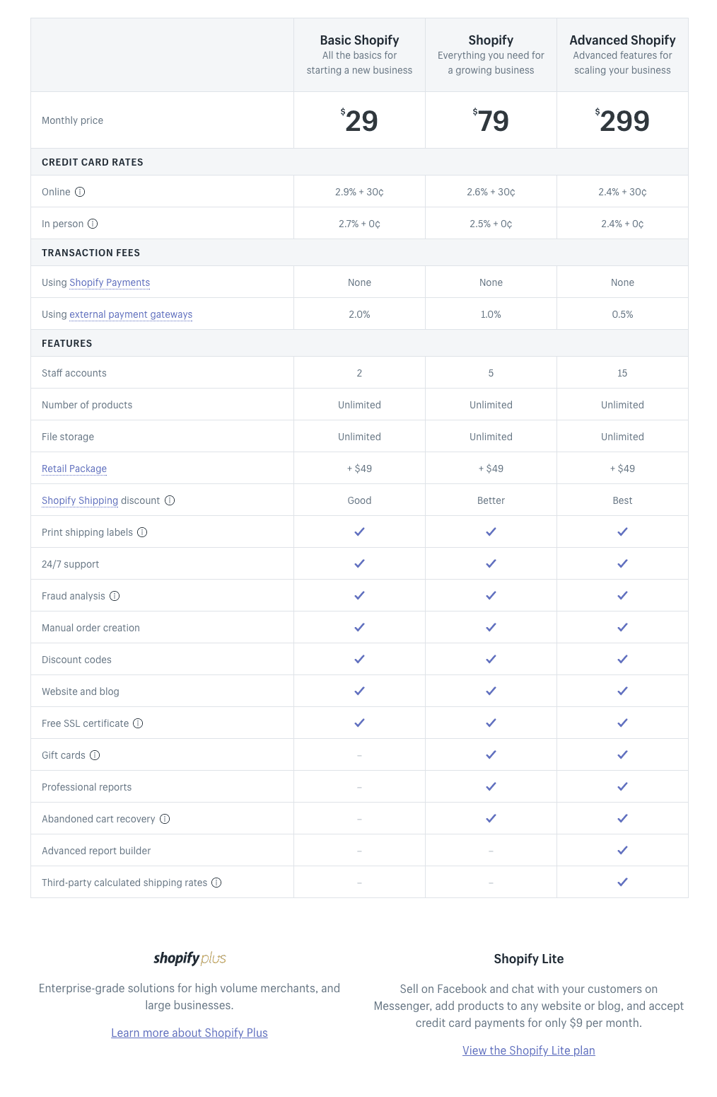
We didn’t spot many changes in this iteration. The Retail Package add-on’s price was alone increased to $49.
Besides the main product, Shopify also has an App Store and an API platform, where developers can build apps for Shopify stores and sell them on the App Store. Shopify shares 20% of the revenue made through those apps.
On one side, the developers get to set up a plugin, get it up and running, and gain discoverability on the App Store in no time. On the other side, Shopify doesn’t charge a one-time fee or a partner-fee but rather takes 20% of every dollar made. Smart.
(The fine print at the bottom of the pricing page says that “These prices are valid until June 11, 2017.” Time for another iteration?)
Key takeaway:
The product goes hand-in-hand with the pricing and value, like three tap dancers. When your product changes its beats, make your pricing and value sync their beats to it. Never lose the rhythm.
Zendesk – Leave no blind spots:
When you hear the two words “Zendesk” and “pricing” in the same sentence, you can’t help but get reminded of their infamous pricing screw-up of 2010.
Three years post their inception, the Zendesk team jacked up their prices across the board, without a clear understanding of their customers’ perceptions. What more? They didn’t propose an option to grandfather the existing users. And to their greatest dismay, it led to a major backfire.
The move made the market leaders to inevitably vacate the entry space of the helpdesk market, and push the door wide open for new players to walk in and gain a foothold.
By 2012, Zendesk found itself losing massively to Freshdesk, and they had to prove its competence in getting early-stage customers and growing, before going public.
And they did, along with an apology post from the founder and CEO Mikkel Svane, who admitted that “We failed. We let you down. And we apologize,” and that they would grandfather the existing customers indefinitely.
The most important lesson that they learned from this setback? Proper price segmentation by customer personas.
Since then, they have been fine-tuning their price points to suit every customer segment (note how each of their iterations focussed on a particular slice of the market).
Over to Zendesk’s pricing story.
2008:

2009:
The number of plans was reduced from 6 to 3. The price for the lowest plan was brought down from $19 to $9. The free plan was taken down.
Zendesk seemed to have picked the best three price points based on the previous version. They’ve reduced the choices, made the pricing simpler and less complicated – paying heed to The Paradox of Choice.

2010:
The agents limit for the Solo plan was increased to 3. Prices were drastically increased in the Regular and Plus+ plans (which subsequently increased certain customers’ monthly charges by around 300%, triggering uproar and criticism). To soften the blow, Zendesk grandfathered its existing customers with no time limit and gave a week to the ones who had already switched, to revert back to the old plans.
The biggest pricing lesson from this fiasco – Pricing is Marketing. If you can’t tie your pricing changes with a change in the perceived value, then don’t.

2011:
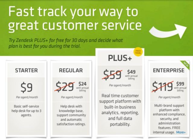
An Enterprise plan was launched. In addition to that, they also introduced a free trial for the Plus+ plan (to appeal to the small and medium businesses).
Zendesk more than doubled its customer base in the previous year and acquired some notable brands like Nielsen, Groupon, Tumblr, and LonelyPlanet. And when such bigger companies began asking for enterprise-level features, the Enterprise plan was pushed out. (Also, note how they’ve overtly pushed annual billing.)
2012:
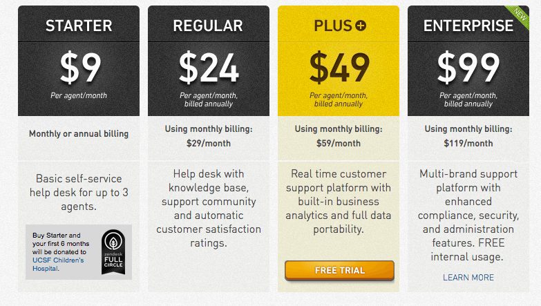
Zendesk played the Causeware game, by partnering with the UCSF Children’s Hospital, as an effort to reduce the friction in its smallest plan.
Note: Support a cause/organization ONLY when you genuinely care about it. Unless the intention is authentic, just don’t do it. Customers can spot a fake support for a cause with an ulterior motive when they see one. In this case, Zendesk seems to honestly believe in the cause.
2013:
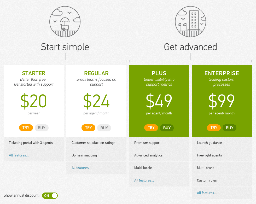
The Starter plan changed from $9 per agent/month to $20 per year. Apart from that change, it also offered a free trial for all the plans.
A very interesting experiment, where Zendesk tried to enforce the early-stage customers to either pay in advance for the entire year or not become a customer at all – a smart move to ensure that the customers were serious and willing to commit. The lowest tier usually experiences the highest churn, and this strategy will help in improving their retention.
2014:
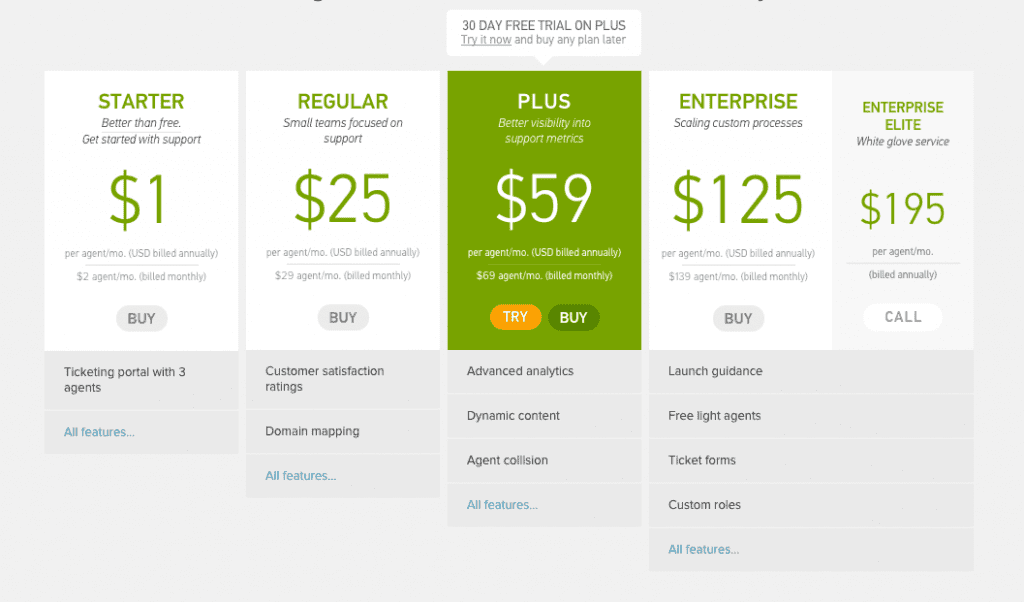
Prices were increased for all the plans. Free trial once again got limited to the Plus plan. Zendesk re-launched its two advanced plans with a new set of features like ticket forms and hourly reporting. A new Enterprise Elite plan was launched (with no monthly billing), which was the Enterprise plan with an additional “white-glove service”.
The most interesting change was the Starter plan’s price from $20/3 agents/year to $1/agent/month – you’d have to pay less than $20/year if you had just one agent, and the moment you got the second agent, you’d have to start paying more than $20/year. Deceptively simple pricing. The release of the Enterprise Elite plan was predominantly influenced by the release of new features and the need to widen its net (it went public in the same year as well).
2015:
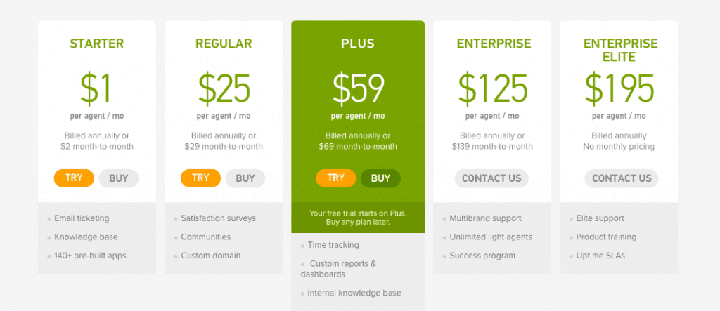
Limit on the number of agents was removed in the Starter plan. The free trial was extended to the Starter and Regular plans as well. Features were differentiated between the Enterprise and the Enterprise Elite plans, and the Enterprise plan no longer offered a self-service purchase option.
As you can see, Zendesk had launched the Elite plan in the previous iteration without much feature differentiation, learned from the customers, then determined the feature set that will suit the plan in the subsequent version. Here, Zendesk made sure that it had a plan for every segment of the market (the 2010 wisdom), not based on the number of users, but on the feature sets.
2016:
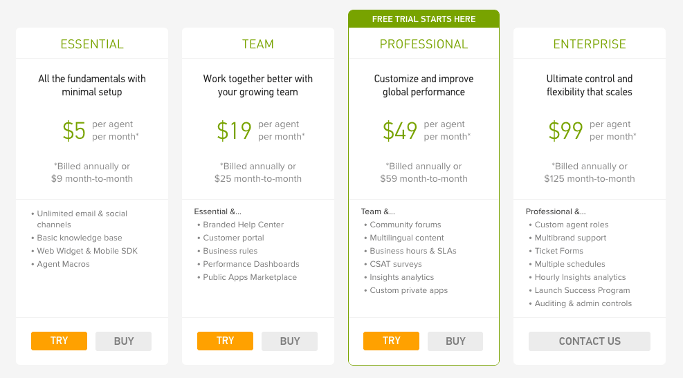
Zendesk launched two new products, Zopim and Voice (which were renamed to Chat and Talk respectively later that year), with their respective pricing plans. The plans were also given more descriptive names that focus on the specific benefits offered. There was an overall drop in the prices (except for the lowest tier) and the Enterprise Elite plan was dropped.
Zendesk was eyeing the mid-market audience. They made their pricing more customizable, where the customers can pick and choose features from a big list of add-ons, and can also club the main product with the newly launched Zopim and Voice products – a customizable pricing model.
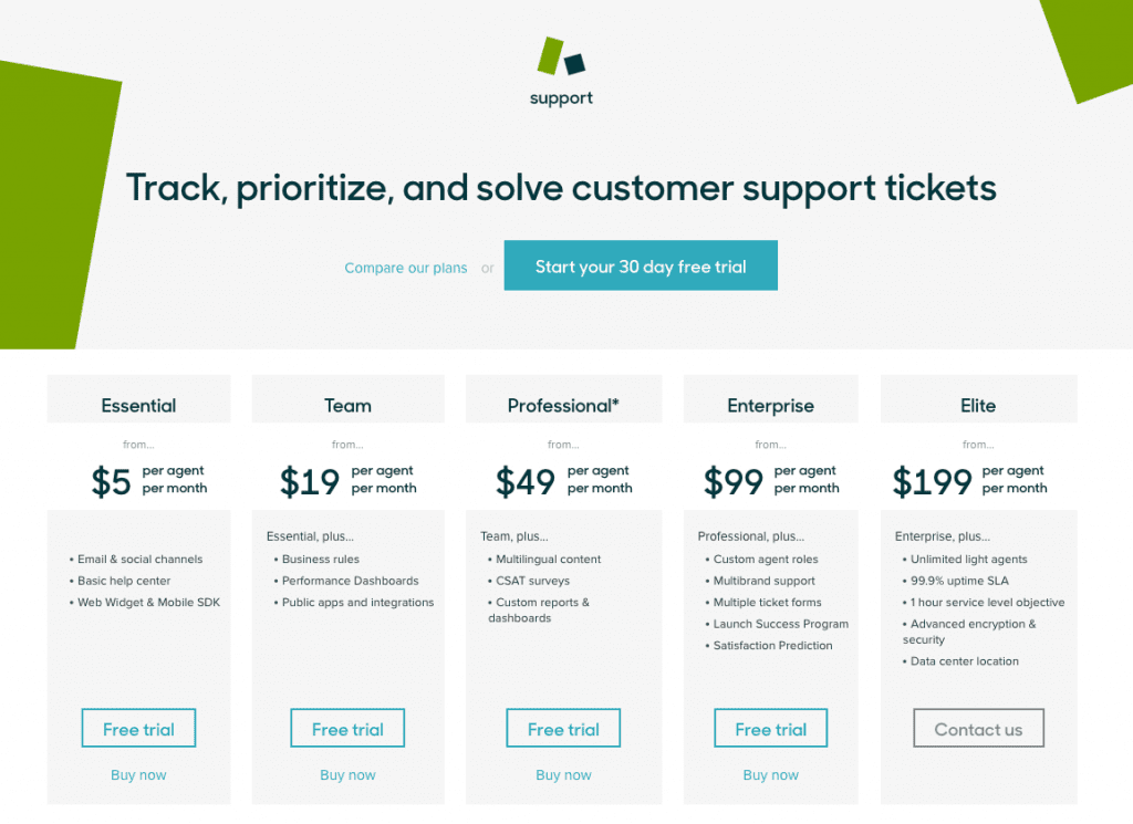
2017:
Five more products were launched (Explore, Connect, Guide, Message, and Inbox). The Elite plan was brought back, and a free trial was introduced to the Enterprise plan as well. The Zendesk Neighbor Foundation which was launched in 2015, was brought into the pricing strategy.
Zendesk once again widened its purview to the enterprise customers.
Key takeaway:
Recognize your audience. Read their minds. Revise your pricing strategy. Refrain from wild assumptions.
StatusPage – Grow with your customers:
At first glance, one tends to dismiss the StatusPage product as a one-page feature.
But only when you give it a bit more thought, will you realize that the effort that goes behind it — pushing out a status page, maintaining it consistently, and enabling any team member to go update it easily (and efficiently, in times of crisis) — is anything but trivial.
A status page is often an afterthought until an emergency arises. It is in that nick of time when you’ll think about how to update your in-house status page, say on GitHub, using markdown, without making an error.
When all you should be doing is write the status just like how you’d write a tweet, and publish it with the click of a button.
And that’s what makes StatusPage special – they’ve picked an underrated yet vital need, obsessed over it, and built the ideal solution for it.
And this conviction reflects in every other aspect of the company.
Including their pricing strategy.
Throughout their experimentation journey, you’ll notice how they’ve been consistently taking well-calculated moves. Whether it was about measuring what the customers were willing to pay before releasing the actual set of plans. Or ensuring that their customers organically climbed up the pricing tiers as their businesses grew.
Let’s begin.
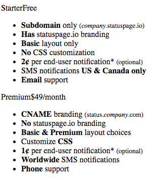
Early 2013:
(Couldn’t catch hold of a better-looking screenshot for this version. Apologies!)
Late 2013:
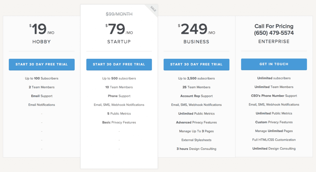
They removed the Starter plan and introduced four plans. The plans had different feature sets, and number of subscribers and team members.
The StatusPage team used the first version to figure out the different feature sets to base their pricing on, and applied those findings in this iteration, ensuring that they had something to offer to each customer persona.
2014:
StatusPage upped the Hobby plan’s price. It also introduced a metered billing model in the Enterprise plan, by having custom allocations for subscribers, team members, and public metrics.
Having gained a considerable recognition for the value that it provides, StatusPage had begun its gradual process of increasing the prices, starting with the Hobby plan. A classic penetration pricing move.
Early 2015:
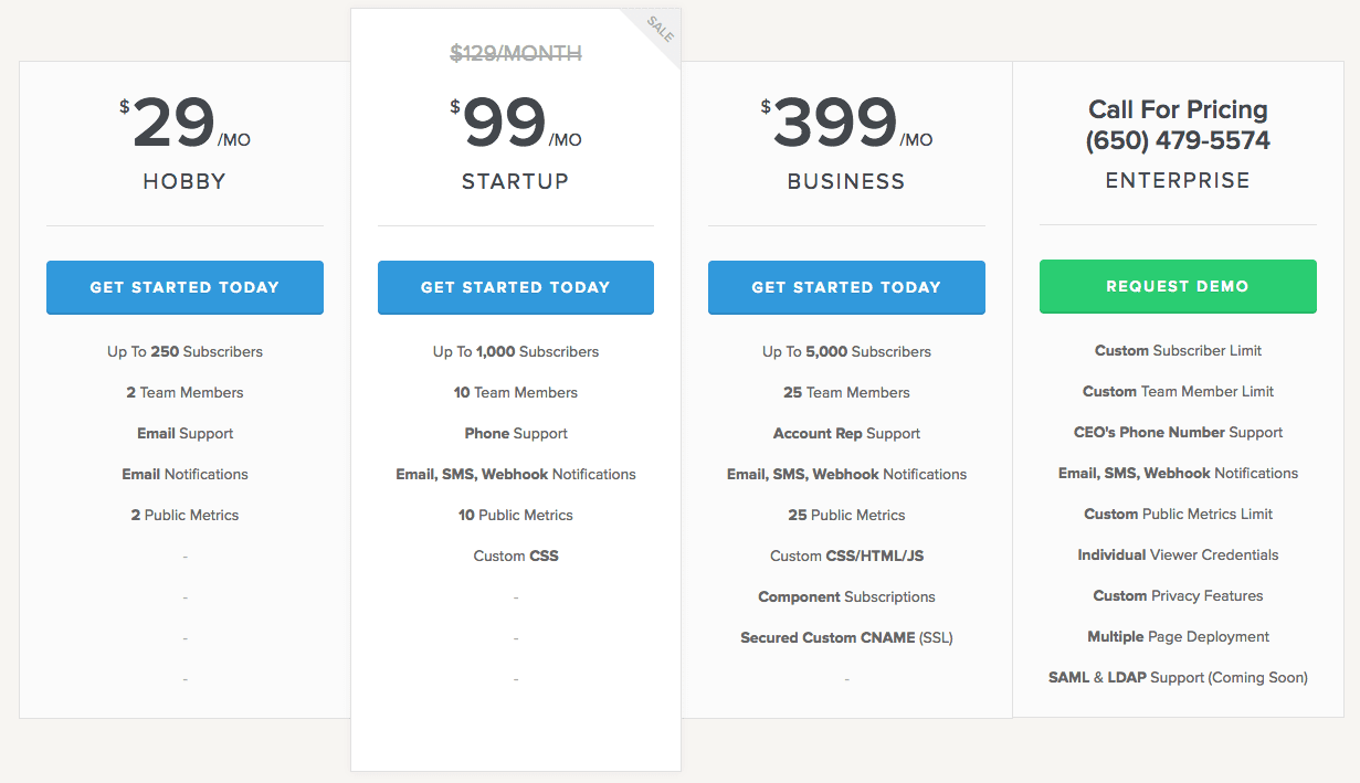
Following the Hobby plan’s change in the previous iteration, the prices for the Startup and Business plans were increased as well. As their way to make up for it, they also increased the subscriber count in all the plans.
Their strategy seemed pretty straightforward – raise the prices, test the conversions, raise them some more, while also improving the value offered. The team apparently raised their prices by 8x compared to their first pricing and boosted their ARPU by 2.4x.
Late 2015:
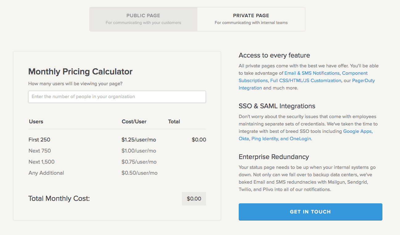
A new pricing section for Private Pages made its debut, with a calculator that works on a /user/month model.
The feature hadn’t been made public yet, and StatusPage was testing the waters for the ideal pricing points for the new release.

Early 2016:
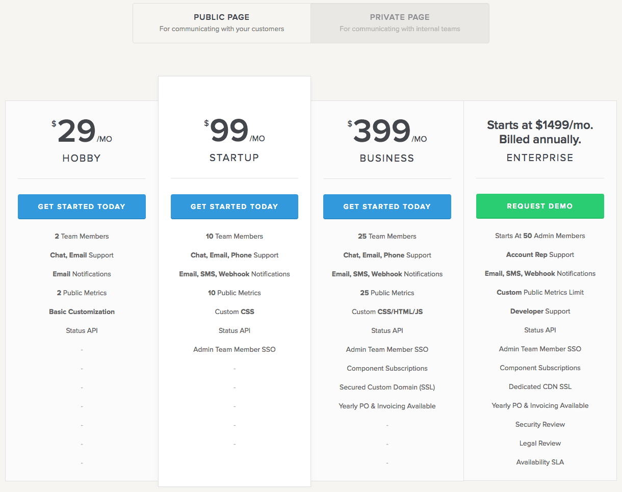
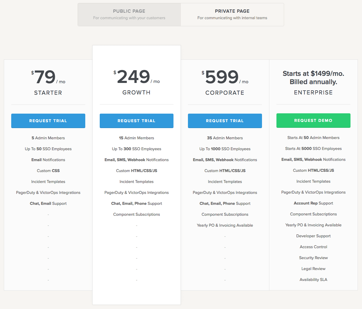
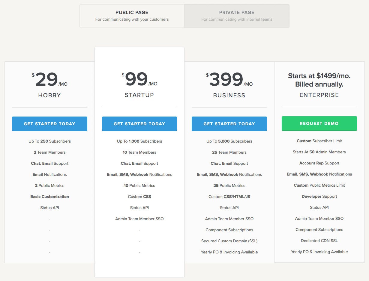
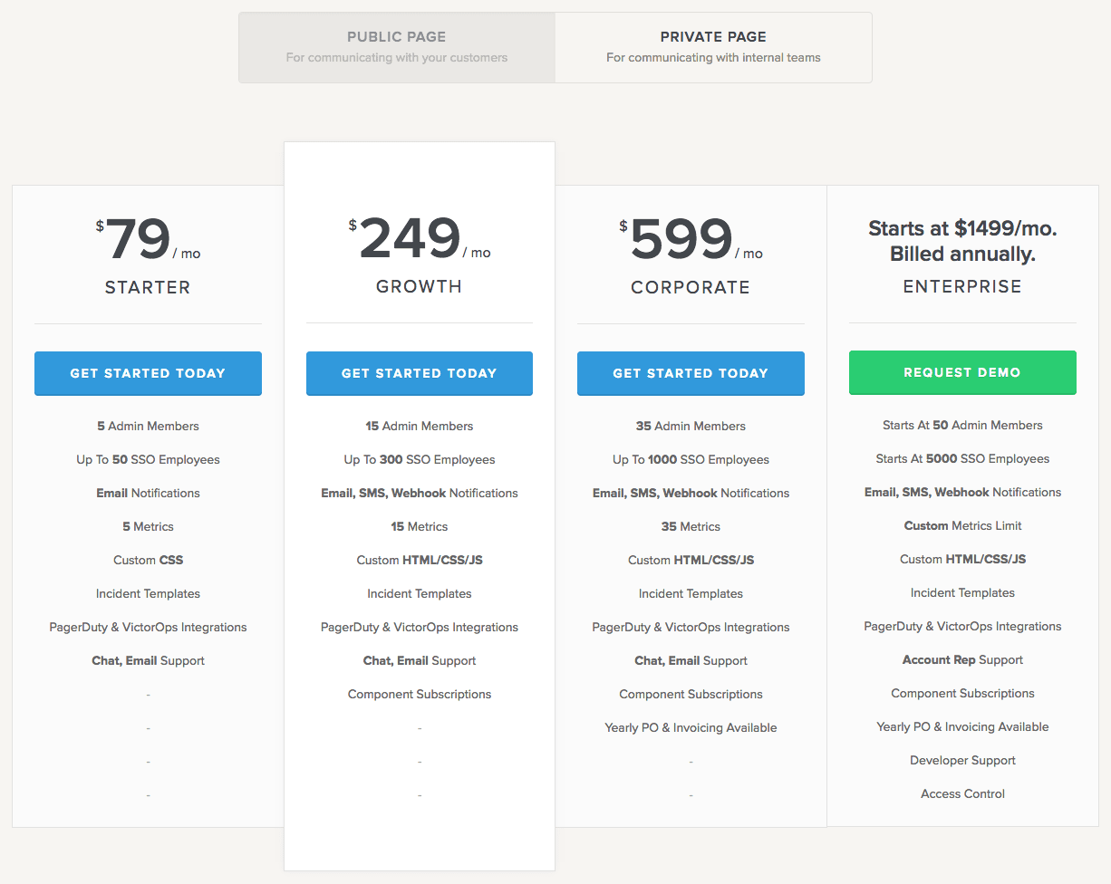
The Private Status Pages were released in the January of that year, accompanied by its own set of pricing tiers. The prices were differentiated based on the number of admin members and SSO employees. The limit on subscribers is also removed in the Public Page section.
StatusPage once again pulled off an excellent job at releasing a tester pricing, ascertaining the market’s response, and pushing out pricing plans that cater to every segment.
Late 2016:
Post getting acquired by Atlassian, StatusPage has only made slight changes in its pricing plans. The number of metrics was introduced as a differentiating factor in the Private Page section, and the number of subscribers was re-introduced in the Public Page section.
What will their next big test be? Only time will tell.
Key Takeaway:
Take measured steps. Test the waters before plunging in. Tailor your pricing based on your core differentiating features that grow with your customers.
Conclusion:
If the credit card industry has to be described in a single word – it’s Cut-throat.
And part of that industry is Capital One, the eighth-largest bank holding company in the United States. Since their humble kick-off in 1994, Capital One has been revolutionizing the industry, starting with the mass-customization of credit cards. And the sole strategy behind their ginormous success? Test and Learn.
Each and every spec of information about customer interactions and card purchases is systematically recorded. Every product, procedure, policy, and personnel is tested.
The team carries out thousands of experiments per year, to improve the acquisition of the right users, retention of profitable customers, and elimination of the unprofitable ones.
For instance, Capital One found out that customers preferred to buy when they called Capital One and not the other way around.
After this discovery, they began selling their products to all the customers who called them, as a result of which, half of their customers bought something else from Capital One within a year.
For every action we’ve taken, we know what the reaction has been. If we sent out a blue envelope and a white envelope, we know which envelope went to which customer — and we’ve recorded what the reaction was in each case.
You might spend hours together in the conference room to fix your strategy, but you won’t arrive at the right one.
Put your versions out there into the real world, learn lessons, and get back to the drawing board to repeat the process.
Your product will continue to evolve. Your customers will keep growing as well. And the bridge between these two is your pricing.
And it is your job to align these three factors throughout your customer lifecycle.
Your product’s feature set, the value they offer, the price point, and the customer’s growth stage – you cannot look at each of these factors in isolation. They are tightly interwoven, and directly impact the customer’s perception, and can fracture or forge your relationship with them.
Test. Rinse. Repeat. Keep looking out for your unknown unknowns.
P.S. With Chargebee’s ease of price management, your team can implement pricing changes with confidence. What more? Chargebee is designed with best practices to grandfather-in pricing iterations so you make conscious decisions. And oh, did we mention that your first $50k is on us? Sign up and give it a spin!
