Redesigns roam and circle between the poles of praise and rejection. No matter the research that aids such endeavors, trading the familiar for the new, as history would attest, is a tricky territory. Yet it’s precisely these deliberate iterations, where progress for users is to be found.
Given’s a given.
All of us at Chargebee, await, with unusually receptive ears and eyes, what’s about to come, how our collective hope to better subscription businesses gets realized with what’s the biggest leap we’ve taken with the product.
A little history is in order?
To me, most SaaS redesigns have always represented mutual coming-of-age stories.
Questions, mostly ponderable, arrive. What’s worth holding on to? How to tease out the significant from the fashionable? How to sustain the ascendance of better learning loops? Which footnote (a smallish feature/a weekend skill) should be turned into a book (a mini-product/a new discipline)? What principles to live by?
As a user scales, with stumbles and leaps, the rungs of new work ladders, acquiring the right ways of thinking and operating, their tools must be worthy companions — serving them not just by following suit but by anticipating what progress would mean in the near future.
Chargebee began, primarily, as a recurring billing app. Because, back then, the subscription world had a recurring billing problem. Amid the complex connections of recurring payments, pricing models, currencies, invoices, books, and other key concerns, much automation was necessary, even vital.
Still is. Even more so.
There were fewer reasons (and fewer personas) for the product to be a system of record. And those very reasons made their way into a simple interface for what was mostly an API-driven setup. Whoever owned the billing operations in a team needed Chargebee to carry out billing-specific tasks.
That was then.
But what has come about over the last seven years is part of what’s fascinating about building software in such a setting. Layer by layer, discovery by discovery, like seasoned archaeologists, we’re all unearthing future monuments that’ll serve the best selves of our users.
We realized that the ever-evolving goals of subscription management weren’t just going to be confined to limited functions. That Support, Success, Sales, and Marketing would have as much to do with Chargebee as Finance and Operations.
This called for a fundamental restructuring.
One that’s kept us busy over the last 18 months. Whether it’s allowing marketers to create the perfect trial-to-paid email sequence or allowing founders to slice ARPU in six different ways, we’ve incrementally added capabilities that enable practitioners across teams.
The existing interface, by design, was never a sound home for these.
Hence, Project Leap.
A major step towards radically better subscription management.
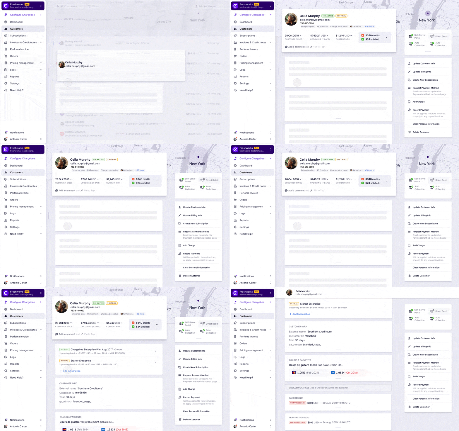
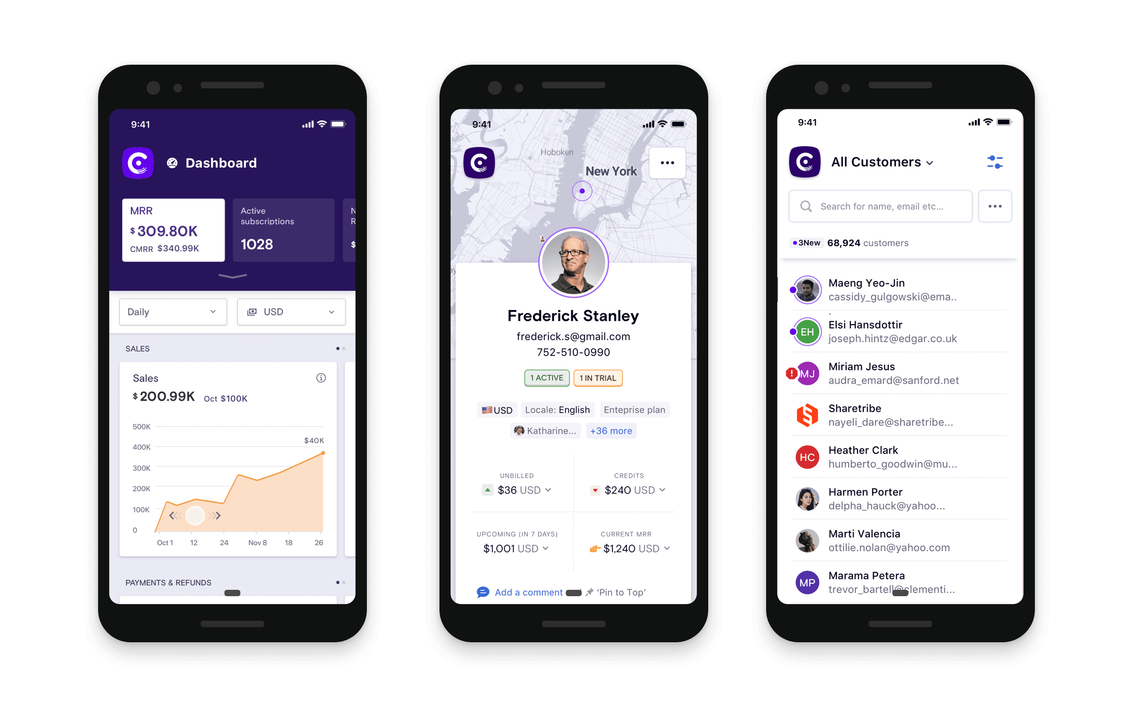
Here’s a glimpse:

Head over to the app to learn more.
This is a baseline, of course. The first 10%. And its newness operates in customary ways. Still figuring itself out, still listening keenly to your feedback and interpreting what subscription success means to different functions and how we can best enable it.
Stay tuned.

