It’s true that friction hurts user experience, frustrates a user, and might even drive them to the point of abandoning your product once and for all. There’s no denying that.
It’s true that spotting the various friction points in the process and smoothing them out is the most fundamental approach to improve its flow. Not refuting that either.
However, that’s just one side of the friction coin.
The other side is positive, purpose-driven, productive friction. Friction used at the right places, with the right amount, will, in fact, enhance user experience.
Now, adding friction just for the sake of it will only backfire. Positive friction disrupts a mindless, mechanical interaction and converts it into a mindful interaction. And not all interactions need to be a mindful one.
What I’ve always said is that you should reduce the number of unnecessary steps; but simplification doesn’t mean the number of steps always gets reduced. In fact, quite often, in order to simplify the process of getting the customer to first value delivered, we have to increase the number of steps.
Include friction only in minimal doses. And only at the most necessary junctions. That will get the user to experience the value faster.
Behavioral Specialist Bri Williams lists down a couple of scenarios which will benefit from a judicious use of friction:
When you need to get a user out of the status quo, especially during acquisition When you need them to take an active decision, instead of a passive one; an irreversible choice When you’ve already made the process effortless, and you want to induce the complexity to stimulate their thinking instead of interfering with doing
And most importantly:
Even if it’s a productive friction, ensure that the user explicitly gets the fact that it’s worth overcoming, and that the reward is much greater compared to the effort.
Positive friction yields positive results, if handled with care.
And this post is about the various ways of handling purpose-driven friction in SaaS products. (Hint: One of them helped us in skyrocketing our activation rates.)
Onward.
1. System 1 and System 2 modes of thought:
The Cognitive Reflection Test (CRT) is a set of three puzzle questions and is considered as the world’s shortest intelligence test.
Two psychologists, Adam Alter and Daniel Oppenheimer, gave the CRT to 40 Princeton University students, divided into two groups. The first group underwent the test in a normal manner and got an average of 1.9 of the 3 answers correct.
The second group, however, had a slightly different test to tackle. Alter and Oppenheimer printed the questions out in a super-difficult-to-read format – a 10% gray, 10-point Myriad Web font, which was also italicized.
In case you’re curious, this is how it looks:

The result? They bagged an average score of 2.45.
Alter states that the difficulty was desirable. That it pushed the students to think a little harder about the puzzles. That it activated their deliberate reasoning, or what Kahneman refers to as System 2 reasoning.
In his book, Thinking, Fast and Slow, Nobel Laureate Daniel Kahneman divides our mode of thinking into two types: System 1 (the quick, instinctive, and unreflective thinking that we employ for most of our day-to-day tasks), and System 2 (the slow, more conscious, and deliberate thinking which demands more effort and cognition from our side).
And according to Kahneman, a cognitive strain or cognitive friction moves a person’s thinking from System 1 to System 2.
Example 1: MailChimp
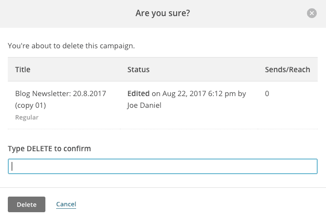
The quickest way to shake someone from the autopilot System 1 mode and launch them into System 2 thinking is by popping up a dialog box. And this becomes more crucial when they’re about to take an irreversible action.
MailChimp throws this confirmation dialog every time a user tries to delete an entry. Note how it adds to the friction by forcing the user to manually type out the words. This gives the user the option to stop, reflect upon their decision, and then take the call. It minimizes the risk of mistakes. And regrets.
Example 2: Slack
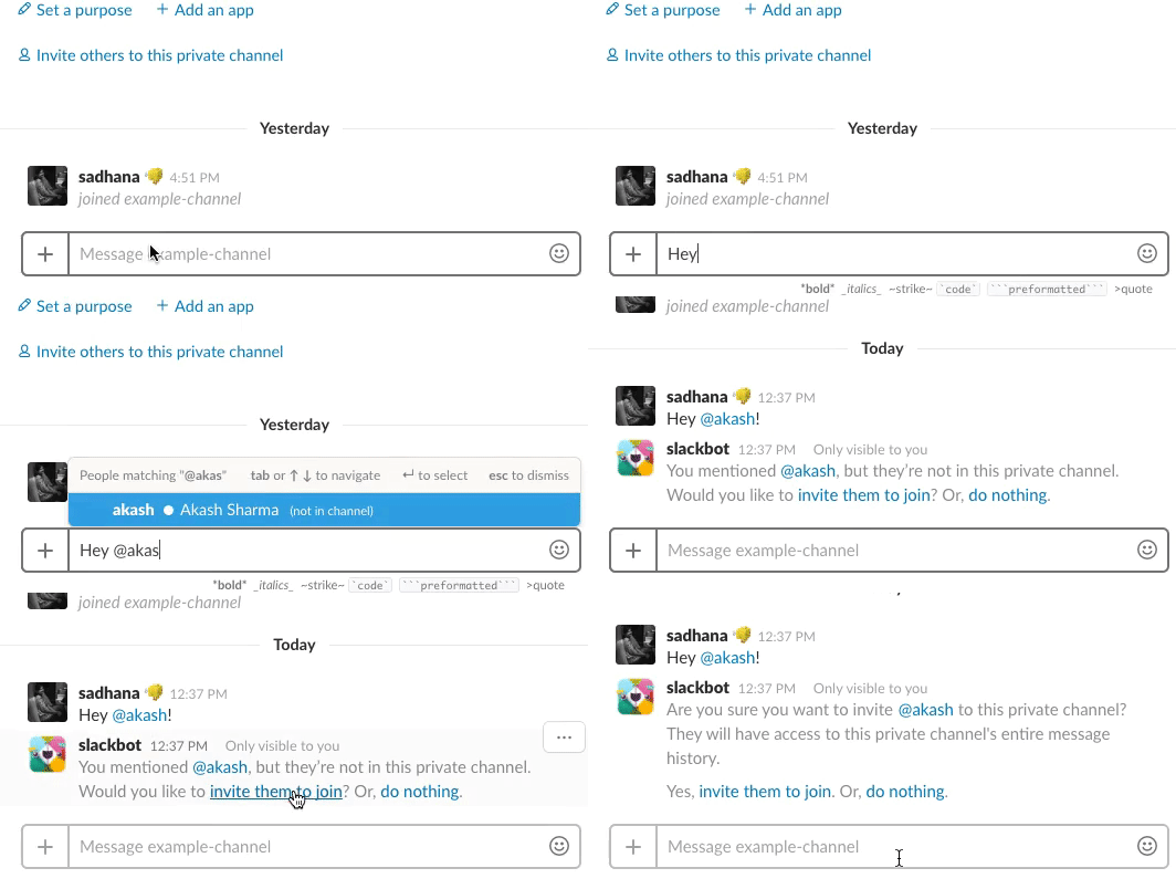
Typing out a message clicking enter is a mindless task that we’ve all gotten used to. And similar to MailChimp, Slack intervenes if you’re sending someone a message too early in the morning or too late at night (i.e., when they’ve snoozed their notifications), you’ll get a message similar to this:

Deliberate friction, like this, helps establish boundaries, and enables you to take a step back and decide whether the message is that urgent that the other person has to be notified outside of working hours or not.
Apart from that, Slack shows a confirmation message when a user wants to add a new member to a public channel. And when the channel is private, Slack also adds a second confirmation message that explains the consequences of adding the new member.
2. Effort, Reward, and The Labor Illusion
The simplest way to evaluate your friction’s necessity and effectiveness is the Effort-Reward balance, or the lack thereof.
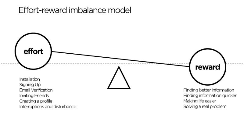
Ensure that the reward is proportional to or greater than the effort. The greater the friction, the brighter the light at the end of the tunnel ought to be.
We all crave that sense of accomplishment. IKEA gets it.
The effort you put in building a flawless table is rewarded by your sense of competence and pride.
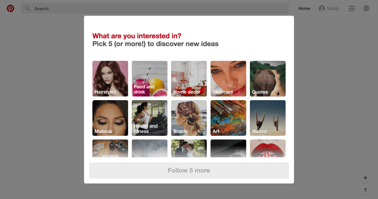
Pinterest adds friction to the signup process by asking its new users to follow a minimum of five topics that they might be interested in, and then generate a custom home feed for them using those topics.
In other cases, where you can’t have your user exert that kind of effort, you can show them how much effort you are putting in for their sakes.
Behavioral Economist, Dan Ariely, talks about a locksmith who was penalized for getting better at his craft. He used to get tipped more when he was an apprentice and used to take a longer time to pick locks, and even ended up breaking the locks quite often. But as he grew more skilled at it and picked locks in no time, customers complained that he was overcharging and refused to tip him.
His customers valued the effort more than his skills.
Consider travel websites, for example. When the user keys in their preferred dates and destinations, they wouldn’t mind waiting for a few extra seconds, as they believe that the website is doing all the heavy lifting for them, scouring through the umpteen travel deals and cherry-picking the best ones.
So the few extra seconds that the page takes to load (aka the friction) indirectly enhances the value of the search results that show up subsequently. IF you are clever with your loading page.
Enter the labor illusion – “a demonstration of effort, whether literal or not, expended to meet the customer’s request.”
Michael Norton and Ryan Buell from Harvard Business School conducted an experiment where the participants had to look for flights on a simulated travel website.
While one group saw the generic progress bar, the other group saw a progress bar which checked each airline for tickets, demonstrating the labor being done. What more? The second group had to wait for as long as a minute to get their results.
And the second service received higher ratings.
Customers find waiting more tolerable when they can see the work being done on their behalf—and they tend to value the service more… Many customers who endure waits but see a running tally of tasks end up happier than those who don’t have to wait at all.
Example 1: Product Hunt
When someone wants to become a contributor, Product Hunt makes it mandatory for them to complete four steps, even before they can visit their profile.
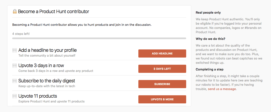
This helps them to vet the quality of their would-be contributors, which in turn will sustain the quality of the community as a whole. Curate content by curating content providers – simple.
We care a lot about the quality of the products and discussion on Product Hunt, and we want to make sure you do too. Plus, we found out robots can beat captchas so we switched things up.
Example 2: Chargebee
Earlier, when a user signs up for Chargebee, we just sent them a confirmation email, which would take them to a limited demo site.
In the current version, however, along with verifying the email address, we also introduced five extra steps for the user to complete the account setup and took them to a fully-functional dashboard:
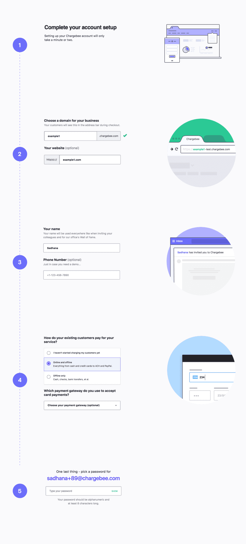
By getting these important details about the customer in the earliest stage of the onboarding process (including the user’s industry in the signup page), Chargebee is able to customize the demo data, and create a more rewarding experience for the user.
Five extra pages standing between the new user and their spanky new test site. That’s a truckload of friction dropped in their way.
And you might expect the users to get frustrated and abandon the process for good, right?
But, the data spoke otherwise.
We saw a 200% increase in the account setup completion rate (Note: the signup rates remained the same during the corresponding period).
There’s a very fine line between what’s challenging and what’s frustrating. I want something to be challenging but I want you to be able to master it. Through work and through bending your brain a little bit, you should be able to figure out something and figure out how to do it more efficiently. But I don’t want something just to be unnecessarily confusing.
P.S. A huge hat tip to our Design Director, Praveen Francis, for helping me with the creation of this post, with the least amount of negative friction.

