You’ve figured out your secret sauce to acquiring customers for your SaaS subscription business. Every day you watch your website stats to see the number of visitors steadily growing.
Things are going north, you think.
And then, you notice how many of these visitors have actually converted to paying customers. Sure, you’re still converting more than when you started out, but the inefficiencies and drop-offs in your checkout are now just staggering.
What’s happening? Why do all these people come by to check out your site, get all the way to your checkout cart, and then leave?
A fast and frictionless checkout – SaaS companies are particularly susceptible to the risks of friction during checkout. And we were not immune to this as well and had to take some robust steps to increase sign ups by 100%. For self-serve SaaS, the Checkout experience is where the rubber meets the road. The slightest slip, and your would-be customer could get distracted, disappointed, or abandon the checkout.
A self-serve, seamless checkout experience could be the secret sauce for better conversions. But where do you start?
- Optimise with the Keep It Simple & Secure approach
- Offer convenience, choice, and control
- Create intuitive, yet sophisticated checkout experiences for different payment workflows
PART 1: Why checkouts need to KISS more
If you want a checkout flow that makes users scream “take my money”, you need to factor in two golden elements —Simple and Secure.
Often, checkout pages are packed with unwanted information that only distracts the customer from the ultimate purpose: conversion. Some examples of obvious friction to a new user while checking out:
- Long checkout process with too many fields
- Security issues (e.g. excessive checks, no signs of assurance, etc.)
- Forced sign up or account creation
The checkout experience determines whether the user will actually complete the transaction or give up midway.
Nobody wants to fill out 50 odd fields before subscribing to a grammar checking service That’s a sure shot way to an abandoned cart 🙁
-
High converting checkouts tear down the sign-up barrier
Pro tip: Don’t force users to add payment details before they start free trials.
Free trials are vital for your SaaS— you can acquire new subscribers; your users can try your product before purchase.Offering a free trial without payment information can reduce friction in users’ sign-up experiences. When your product caters to a niche set of organisations, you should make your sign-up process as frictionless as possible for users to evaluate your product amongst other competitors. And if you want your product in more people’s hands, then go for the no-credit-card-required sign-up process.
On the other hand, some businesses choose to collect payment details before a free trial, and that has its own set of pros:
- Improved lead quality; higher trial-to-paid conversion rate
- Smoother conversion experience as the user does not have to enter additional information when they later convert to a paid customer
You can pick either the card or the no-card strategy and run Free Trial experiments to see which yields the best results for your business. At Chargebee, we choose the no-card strategy for free trials.

-
Design experiences; don’t design forms
Less is more. Every additional field in your checkout is a hurdle your would-be customer has to cross. Do you really need a user’s phone, email, and address right away?
Now ask yourself if it’s worth the possibility of losing a sale — or thousands of sales — just because you want to fill a database. Only ask what’s relevant!
Exception alert! If you are a SaaS business that generates leads and then passes them on to your sales, then there are definitely lead data concerns. Consider opting for data enrichment services (like Clearbit) that add rich meta information without having to explicitly collect them at checkout.
Bonus tips to optimise forms for conversions:
#1 Pre-populate as many fields as you can
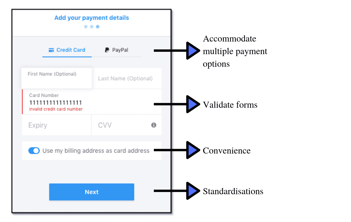
#2 Communicate errors clearly via error messages
#3 Automatically provide real-time validation as a user types. The easier you make it to complete forms, the less errors people will make. It’s a win-win.
#4 Ensure that autofill works consistently across platforms and browsers, so that your customers can check out faster.
Craft mobile friendly forms for those mobile users who already represent a hurried, less-tolerant segment of users.
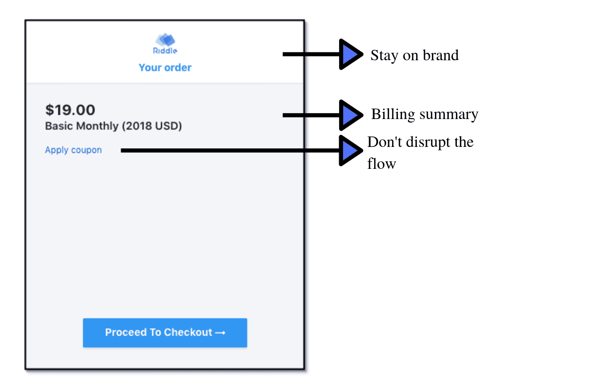
#5 Coupon code fields can help and harm. While they are an effective way to win customers at checkout, ensure it does not impact the purchase flow. Test and iterate to see what works for you.
-
Customizations and Clicks – when less is more
When it comes to customizations, Kevin Clark, the Design Lead at Shopify suggests:
“Don’t give users so much rope that they hang themselves.”
Ensure the customizations applied to your checkout page are consistent and familiar. Beware: A slightly different background color, new fields, buttons with different colors, varied font types or sizes can break the experience.
Limit the number of clicks and make navigation smooth. There are pros and cons to the idea of going with a single or multi-page checkout. The important question is, how do you pick the one that’s right for you? Learning about your audience and constantly running tests.
Emphasize Security and Privacy
Customers need constant reassurances on security and privacy. Checkout pages collect sensitive payment information and personal information as well. You need to show customers that you are serious about security and you’re taking every possible precaution to safely handle their payment data and personal information.
These are few important security goals you need to achieve to win your customer’s confidence:
- Have a Secure Sockets Layer (SSL) certificate for your website in order to provide a secure connection and encrypt credit card information.
- Comply to PCI Security Standards Council (PCI SSC) to protect card data
- Adhere to ISO, SOC 1 & SOC 2, and MFA standards to ensure Internal Data security.
- Follow network, application and operational level security policies.
- Display your security credentials with SSL and PCI badges, just the way Chargebee does in the screenshot below.
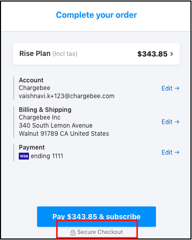
Pro tip: Subscription management platforms like Chargebee take on all your security and compliance heavy-lifting so you can offer a secure checkout experience without building all the capabilities yourself.
“Unless you have expertise in the space and are aware of security risks & infrastructure needs, do not set out to build your own billing. It’s not an efficient use of your time.”
– Fred Stutzman, CEO, Freedom
PART 2: Choices, Convenience and Control
SaaS purchases aren’t driven by impulse. They’re driven by experiences.
Markets today are driven by choice, and your customers have multiple good alternatives to choose from. To survive, your business needs to differentiate. So does your checkout. A compelling experience offers users more choices to pay, more control over payments, and more convenience over the checkout process.
1. Spoil customers with multiple payment options
Offering users the choice of multiple payment methods is more than a mandate to curb drop-offs at the checkout. According to a report by WorldPay, 55% of users would cancel their purchase if their preferred payment method was not available. Note the word “preferred.” Payment methods and choices vary from country to region, and buyer persona and individual preferences. Some cultures are comfortable handing out their card details, while others are still averse to credit card risk. Higher ACV customers may prefer direct debit, while traditional businesses still rely on old fashioned check leaves.
2. End-to-End localised checkout experience
Localised checkout experiences convert better. You make it easier for users to understand what they are paying for and you are able to accept payments in modes that THEY prefer.
-
No more currency converters: Support for multiple currencies
As your SaaS business grows your checkout must be ready for cross-border sales. When your checkout allows users to checkout in their local currency, you also save them money – restricted currency options, mean that users end up paying extra in conversion costs. And no one likes extra costs.
Did you know! Chargebee supports payments in more than 100 currencies
-
Your Checkout should speak more than Just English
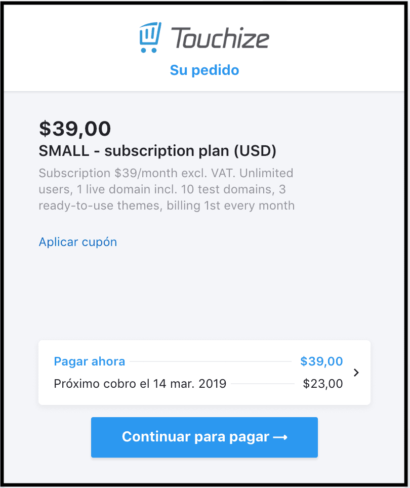
Put yourself in your customer’s shoes and go through the entire checkout process in a foreign language —FRICTION. Don’t let language barriers or miscommunications create a bad checkout experience for your subscribers. Below is an example of a checkout that talks to customers in their native language.
Here is the complete list of locales supported by Chargebee.
PART 3: Intuitive, yet sophisticated
A checkout that does more than what is expected.
At each point in growth, a SaaS business will encounter different workflows and objectives. We need to think of checkout solution as a one-stop shop that can accommodate all the requirements that your business might have now and also the ones you might need down the line.
SaaS businesses encounter use cases like this every day:
-
Handling International taxes
A possible buzzkill to globalisation is International taxes —tracking the customers’ locations, calculating the country’s local tax rates, complying with international tax laws. Businesses need sophisticated checkout that can dynamically calculate and apply accurate taxes in real-time.
-
Mastering the art of up-selling, upgrades and add-ons
Up-selling not only accelerates SaaS profitability but is also critical for customer retention. Up-sell opportunities in SaaS include —add-ons, plan upgrades, etc.
- Whether a user bills a recurring or a non-recurring add-on, a flat-fee or a tiered add-on, or makes quantity changes to add-ons —a checkout should be efficient to handle all scenarios elegantly. A transparent and clear breakdown of the payment that the user has to make adds value to the checkout experience.
- Customers might shift lanes. And when they realise they need more product offerings and a better plan, they shouldn’t have to wait for a turnaround between your support and sales teams. Enable self-service through your checkout, so customers can upgrade at any point with zero friction.
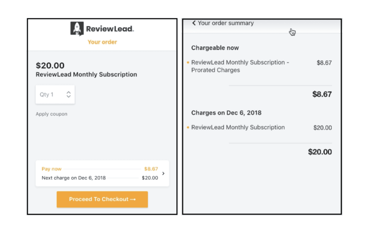
- When a customer changes the subscription plan/quantity in the middle of the billing cycle ( different businesses, different billing cycles ), your billing platform must prorate the charges based on consumption. And to make this effective, you need a checkout that is equipped to convey the prorated charges with clarity.
-
Track the drop-offs to convert the “Maybes” to MRR
Cart abandonment data is King. The number of visitors that leave your checkout without completing a purchase serves as a source for tracking lost revenue and dropped checkouts. And anything that can be measured can be improved.
REMEMBER to Test, Test, Test
With any listicle that includes tips and tricks to optimise checkout and increase conversions, you should remember that no matter how certain you are that one idea or the other might work for your business – It’s always worth testing everything.
Wrapping up:
In the world of SaaS, everyone is paid in two coins: Money and Experience. With a powerful checkout, you get to drive both.
These must-haves and essentials are ideal points for optimising your checkout pages to achieve the ultimate goal of a frictionless payment experience. Yet, there is no one-solution-fits-all approach.
Using a subscription billing platform like Chargebee, you can build smart checkouts that offer a frictionless payment experience, that will fit your workflow like a glove. Want to learn more about how Chargebee can empower your checkout experience? Sign up for our forever-free sandbox account, give it a spin and let us know what you think.
At Chargebee, we are committed to helping you make checkout frictionless.

