‘How does a user onboarding flow end?’ and other difficult questions
How does a user onboarding flow end? And when? Does it extend past the first mile? If it does, where are the lines between user onboarding, feature adoption, and customer success? Are they different things at all?
We’ve been obsessing about every tiny user onboarding detail at Chargebee over the last few months—where to begin, how to cater to intent, what creates delight, and how to ask questions—easy questions.
But we’ve been tiptoeing around tough ones. And they are tough.
On the one hand, you have what I call the fuzzy view or the view that user onboarding never really ends.
Here’s Samuel Hulick snaring the essence of it: “Well, it gets a little philosophical at this point, but I usually define onboarding as a continuum. I believe an onboarding opportunity arises anytime there’s a gap between what the user is currently doing and what they’re capable of doing based on everything you provide to them.”
On the other, you’ve got the clear-cut view or the view that user onboarding ought to apply only to the initial use of your product.
Ty Magnin puts it in a nutshell perfectly: “Users are not customers…the situations of the user and customer are entirely different. Their motivations are different. Their abilities are different. When you look at it, they’re on the opposite ends of the scale. They differ in approach, ownership, and the way you should onboard them.”
Both sides have fair arguments. And this means the lines between onboarding for the first mile and onboarding for the nth are difficult to discern. What does each look like?
We can’t avoid the tough questions forever, though.
Kathy Sierra explains why in her book “
Badass: Making users awesome”: a great first mile + not-so-great miles after that = product quicksand.
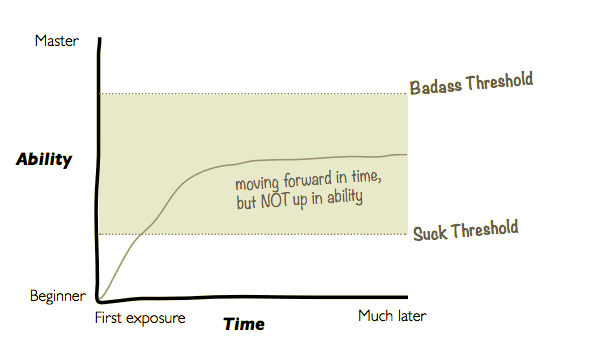
Product quicksand and what it means
To put that graph in perspective, here’s what a user journey looks like when every mile is a great mile. This is what all products want—for every user to be in the top corner of this graph. Going from strength to strength and success to success with use and engagement.
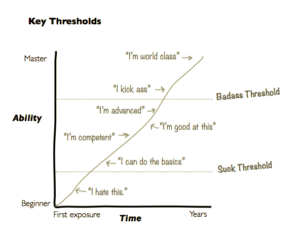
It’s hard, though. Especially when you have a complex product. We certainly do. And when users feel like they can’t move forward, one of two awful things happens:
- Users stay stuck in product quicksand.
It might look fine but it’s not.
Kathy explains why: “This might look good on a spreadsheet for user retention,” she writes, “But if [users are] no longer moving up and to the right, they aren’t increasing resolution, gaining new skills, or becoming more powerful. Their enthusiasm for their new abilities and results will slowly fade.” - Worse, users can tip back down over time and begin to feel like the product isn’t working for them. At which point they will no longer be users anymore.
Product quicksand almost always means churn, in other words.
Here’s the thing: I just don’t understand how product quicksand even happens. If you’ve crafted a beautiful first mile that propels users to the promised land, how could it be that they can’t discover new ways to make it better?
How is it that you can sell users on your product and then fail to sell them on your features?
My sense is that it might be a consequence of the vagueness around what the transition from the first mile to second and beyond looks like. A hesitance around how to balance onboarding for activation and onboarding for retention.
In what follows, I’m going to clear up the lines of ambiguity around user onboarding for the first mile and the nth and give you five tactics (three on flow and two on mindset) that we’ve learned to apply to any onboarding that happens in the user journey.
Onboarding at the first vs. the nth mile
Let’s begin by zooming out a bit. It’s worth taking a look at the difference between the first mile and the nth if we’re trying to get at the difference between onboarding for either.
What’s actually happening when a user progresses in her journey through your product, Kathy argues, is your user is getting better and better at integrating your product into the big life thing she’s trying to be better at (integrating your camera, for example—if you were building cameras—into her big life thing of being a better photographer).
Understanding this is the key to keeping customers for life, argues Jonathan Kim, the founder of Appcues, in his talk, How To Keep Customers For Life.
When you do, he says, you see that you need to do everything in your power to push and guide this integration along over the course of a user’s journey.
In the short term, this means creating success with user onboarding. In the mid term, it means helping customers integrate your core features. In the long term, it means getting out of the way (for the most part) and surfacing the right features when you find that a customer needs one of them.
Jonathan’s ideas align so beautifully with Kathy’s because they’re both saying pretty much the same thing: the best way to keep users is to keep making them awesome.
Here’s how their ideas overlap:
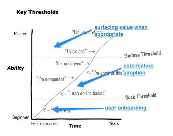
Calling it ‘feature adoption’ really sets a bad precedent. There’s so much more to making customers awesome than throwing features at them and hoping a few stick.
The term ‘feature adoption’ underplays (if not entirely discounts) how feature/product fit is found, it says nothing of whether features align with a user’s workflow, and it ignores how features are adopted.
Users integrating a feature into their lives isn’t something that just happens, it’s something you pursue, and something you fight for.
It’s time we replaced the term ‘feature adoption’ with something that captures this. ‘Customer onboarding’ is the perfect replacement.
When a user signs up, user onboarding propels them to initial success and they go from ‘I don’t get this’ to ‘I can do the basics’. Onboarding customer onto core features and expanding their use takes them from ‘I’m competent’ to ‘Hey, I’m good at this’. Getting out of the way and interrupting only to onboard them onto a relevant feature that will bring them even greater success (whether it’s new or it has been around for a decade) will take them from ‘I’m advanced’ to ‘I can kick ass’.
Let’s dig into how they might be different.
Ty and other advocates of the clear cut view are right—user and customers have different contexts, motivations, abilities. And this means different data, approaches, and onboarding.
But there’s one crucial difference (or similarity, depending on how you look at it) they’re missing.
A product is composed of features. This means that both user and customer onboarding are onboarding onto features. Yet, while one says ‘this is the promised land’, the other says ‘this is how the promised land is getting better’.
Why?
Because one (user onboarding) has to present the features as a whole (this is the promised land). And the other (customer onboarding) has to present a feature as a part of the whole (this is how the promised land is getting better).
Rolling with this idea of composition, here’s how I would frame the difference between user and customer onboarding: in the first mile, you’re onboarding users to your product (as a whole). In the nth, you’re onboarding them onto features (new features, old features, whatever part of your product your customers need to be successful at the time).
So. In light of the points of difference (and similarity) between user and customer onboarding we can ask:
- Is it possible that your user onboarding sets the foundation for any sort of onboarding that is to follow?
- Can seeing the connections between the two help you use usage data for better customer onboarding?
- Can a user onboarding mindset make customer onboarding easier?
The answers are yes, yes, and yes.
Putting user onboarding to work beyond mile no.1
Seeing user onboarding as helping new users find the aha of the product and customer onboarding as helping customers (who are in the promised land) find the aha of features helps us see the points of difference between the two a little better.
User onboarding has to deliver on the promise of the homepage and customer onboarding has to orient new features against it. The fact that one helps activate and the other helps retain doesn’t imply that they’re two entirely different things. They work together. And this means you can put user onboarding to work long after your user onboarding flow has ended.
Here’s how.
A. Laying the foundation for the nth mile in a user onboarding flow
First, let’s talk about the user onboarding flow. Here are three ways you can tweak your user onboarding flow so that it actively makes space for what’s to follow.
#1: Set up expectations for feature-driven success
Give users a glimpse of what’s in store.
This glimpse can either let users in on the fact that there’s lots more to discover, that other users are using features in creative ways (for problems they might not be expecting), and that there is breadth to the solution you’re offering.
Of course, user onboarding has to be light; more than just a peek at a feature can overwhelm.
This is why I don’t like tactics like in-line hinting and tooltips that point to other features during onboarding. They’re just too distracting. These glimpses need to be a little more subtle, a little more passive—loading screens, prepopulated data, alternate tabs for the curious, and microcopy.
Here’s how a few businesses handle it.
Intercom hints at the use cases that it can handle (even if users arrive with the intention of using it for something else) during signup with an unobtrusive tab:
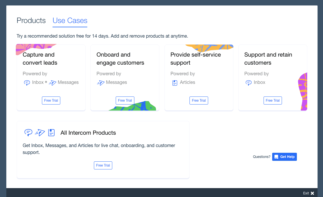
The ‘Products’ tab is the default (it’s where you let Intercom know which of their products you’re interested in when you sign up), this ‘Use Cases’ tab is only for the curious.
On the other hand, ActiveCollab hints at the breadth of the product with a prepopulated project:
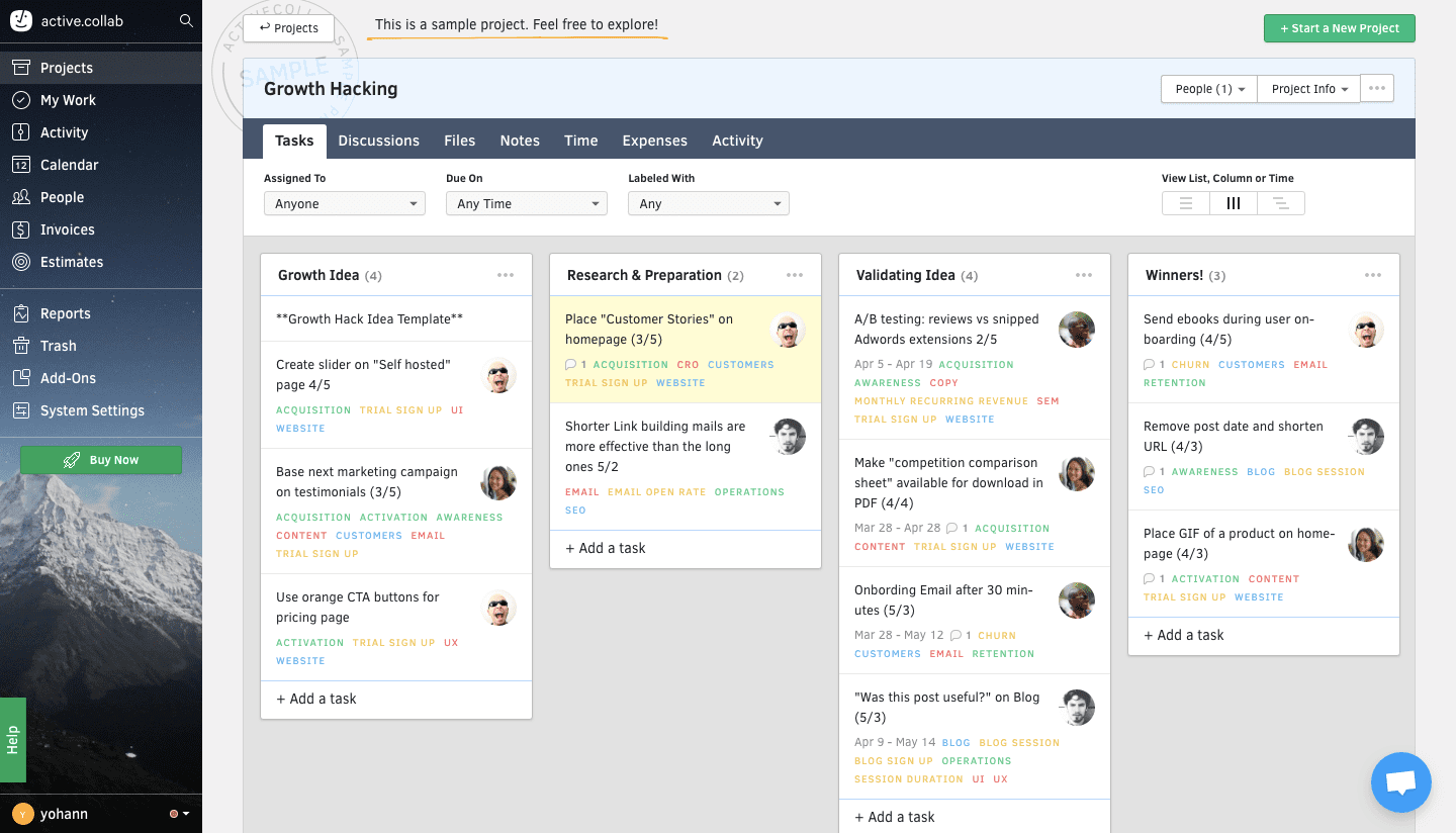
For someone who’s new to project management, this can be overwhelming. But it also suggests that there is so much that ActiveCollab can help you get done.
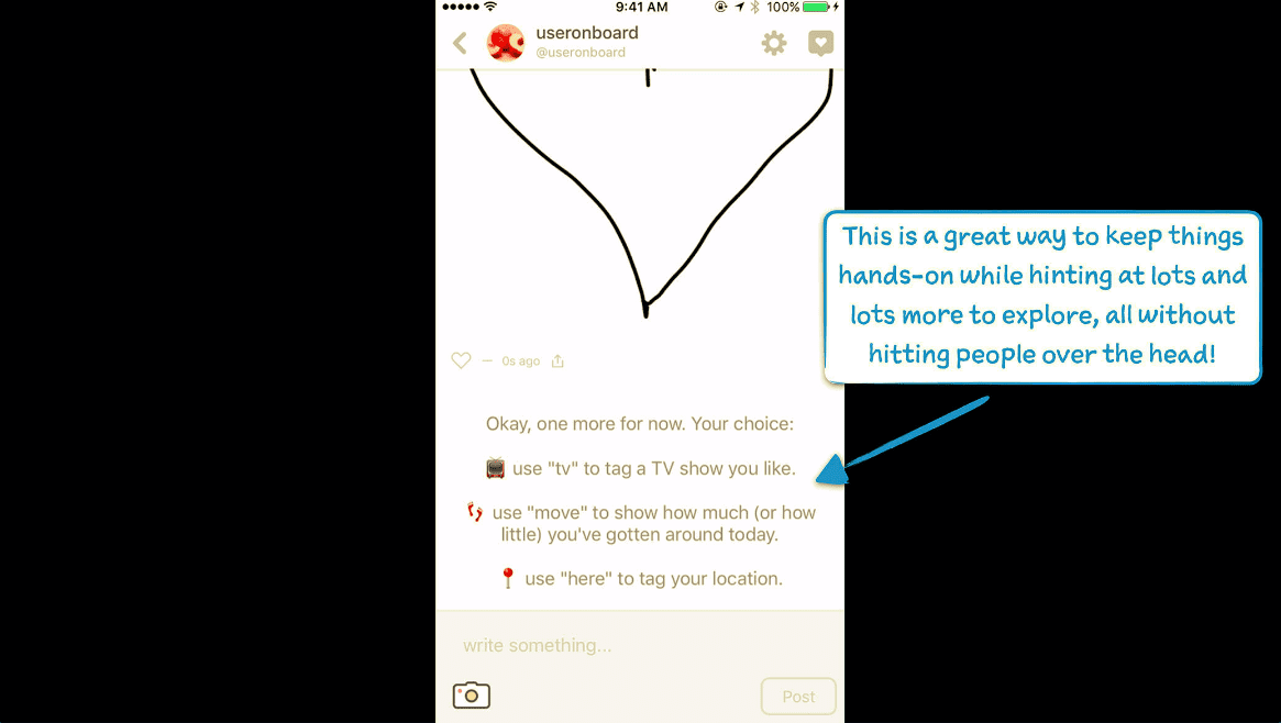
Samuel Hulick on how Peach manages to pull off being “hands-on while hinting at a lot more to explore”:
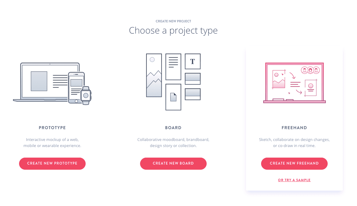
And finally, here’s Invision, creatively suggesting that there are lots of projects you can use it to handle even if you’ve got just one on your mind right now:
That’s all you need to set up new features in user onboarding: a hint, a spark, a set-up. Far from obtrusive and distracting. The fire will happen on its own as a user gets familiar with your product.
#2: End the flow on a customer onboarding key
If user onboarding ends with delivering a user to the promised land, what better way to end the flow than with a setup for something that can make the promised land even better?
Most apps end their user onboarding flow rather abruptly and I’ve always seen it as a suggestion that it’s time for me to start exploring the product on my own. Canva, for example, redirects to its dashboard post user onboarding flow.
There is the rare app, however, that ends their user onboarding flow with a suggestion for a next step that builds on the actions it has just helped me complete.
Some apps, like Headspace and Duolingo, have it easy. When onboarding is the first lesson, all it needs to end with is directions to the second. Netflix and Hulu have it easy as well—the sooner they get out of the way and let me watch an episode of The Good Place, the better.
It’s a little more complex when you’re dealing with a product that is made for different kinds of users and has tens of possible features on the table. Here’s the last pop up you see in Buffer’s onboarding flow and it really expands on the promised land (this might be a little outdated but it still stands):
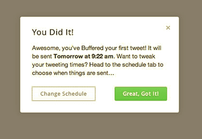
And this doesn’t get in the way of my exploration either. When I close the pop-up, I’m at the dashboard—the same place I might have been without this suggestion anyway.
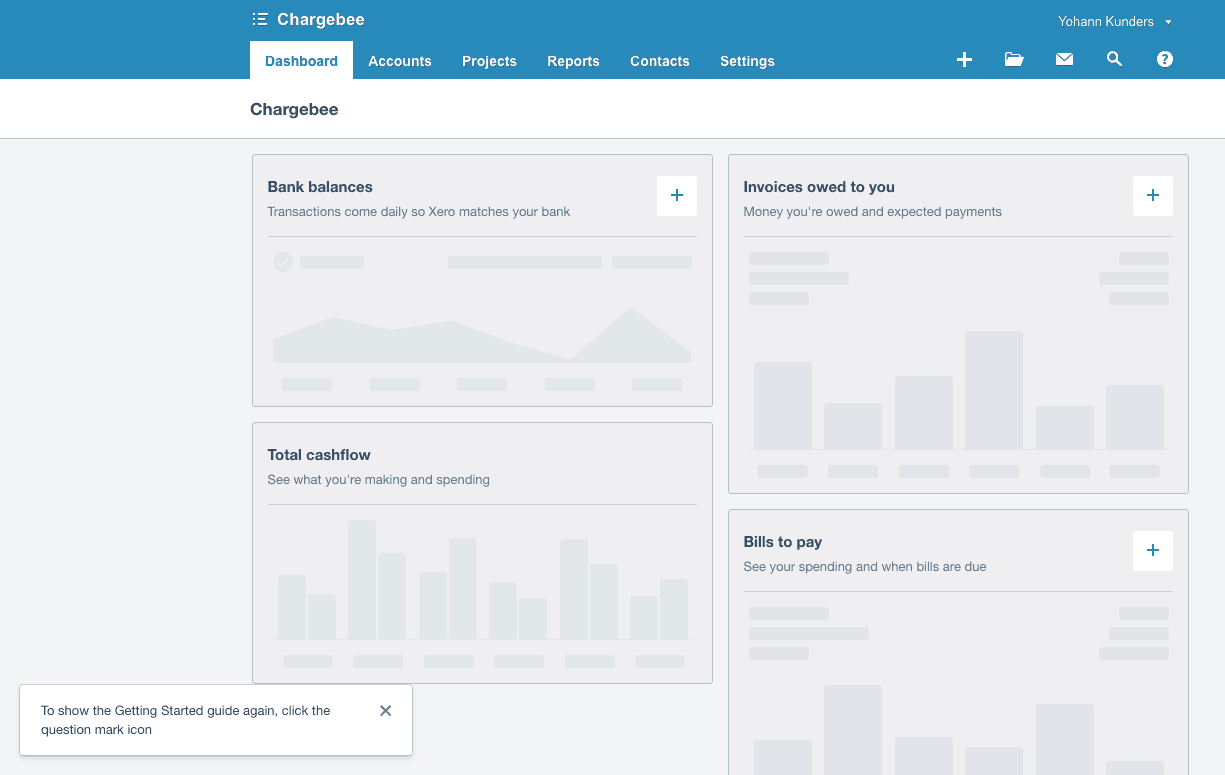
Alternatively, Xero handles ending their user onboarding flow on the dashboard in style. It’s literally a list of next steps:
#3: Set up the vocabulary of the product
If your features come with lingo, your user onboarding flow can set it up.
This way, she won’t have to spend too much time figuring out the feel of the product in her post-onboarding exploration, she’ll gradually be immersed in it from the get-go.
There is a caveat: Like setting up feature-driven success, introducing vocabulary needs to be subtle. An overwhelming onboarding flow can not only fail to set up customer onboarding, it can harm the promise of the product.
Here are two apps that manage to do it beautifully.
IF, IFTTT’s mobile app, works the vocabulary that you need to use it into the very first use of the product. No better validation than from Samuel Hulick:
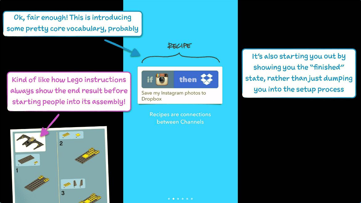
The idea is that when I enter a user onboarding flow, I haven’t formed clear concepts of what it means to perform an action. Especially for a complex product like IFTTT (few of us are integrating applications like Instagram and Dropbox together every day), giving what I’m doing a name the
first time that I do it doesn’t get in the way of the learning, it enhances it.
Here’s Facebook’s Slingshot, on the other hand. Another screenshot from Samuel Hulick enjoying the new vocab:

Both examples work for two reasons:
- Only the core vocabulary is introduced. A concrete question to guide whether vocabulary is core is, ‘how far can a user go in my app without needing to know this word’? The closer the answer to zero, the more core the word.
- The vocabulary is introduced before any real use. The action is new, opinions are just about starting to form, it’s easy for the word to take root and establish itself.
B. Taking the mindset of user onboarding into customer onboarding
Second, the mindset of user onboarding is aha focused. Crafting the first mile of the product means balancing education, showcasing features, and action so that it comes together perfectly in an aha moment.
Of course balancing, in turn, means three things:
- Identifying the core value of your product,
- customizing the first mile based on intent, persona, or job-to-be-done, and
- eliminating anything in the flow that delays getting to this aha moment as fast as possible.
The controversial question is when an aha moment occurs.
Is it a magical moment that manifests when a user completes an action? What about when she’s reading a blog post? Can your product’s aha moment come from a friend telling her about it, months after she’s tried your product?
I believe all three are possible.
Tying an aha moment to an action or place blunts the beauty of it: it’s an instantaneous, emotionally-driven connection.
Eric Weiss gets the definition right, I think, when he says: “[The aha moment is] the moment in which [users] grok at what your product can do for them, and they can’t wait to use it again. Your marketing materials made the promises, and your onboarding shows the proof.”
This can happen anywhere, under any circumstances.
This is Lex from Jurassic Park, figuring out how to work the computer and save the day. Look at her—that’s an aha if I ever saw one. And there are raptors outside.

User onboarding propels a user to the product’s aha moment and customer onboarding to features’. So it follows that the mindset that got user onboarding off the ground can be put to work at the nth mile.
The following are built around aha moments and are fundamental to the user onboarding mindset. They are what make onboarding users onto the product so effective. And they can be applied to feature/customer onboarding too.
#1: How user onboarding gets it’s aha
User onboarding gets its aha by positioning the product against a greater good.
What this means is that an aha moment is more than a consequence of how good the solution is, it’s a consequence of how well the problem is articulated.
The better the problem is framed, the better the aha lands during user onboarding.
Here’s the Sunsama promise, for example. Great work organized so I get the best of Trello and Google calendar.
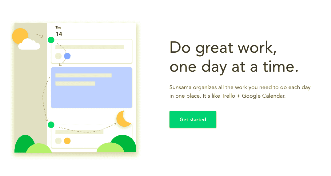
The promise immediately sets up the shortcomings of Trello and Google Calendar (both tools that I use) and how much easier it would be to have a tool that had both side by side. This framing is one half of the aha moment. The other is the delivery, which Sunsama handles delightfully:
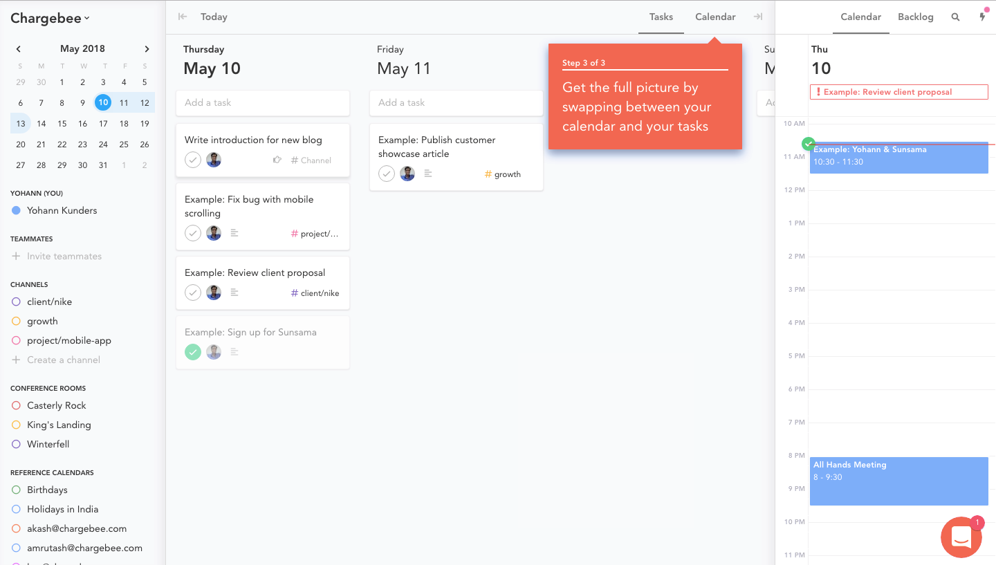
An aha is only as good as its tie to the greater good and its delivery on that tie.
When a feature is trying to get to its aha, it has to tie back to the greater good that got me through the door in the first place. It’s not enough to point at what the feature does, it’s essential to point at how it can help me get better at the thing I hired the product for.
Here’s an amazing customer onboarding email from Trello (I still love Trello) to illustrate. For reference, this is Trello’s promise: ‘Trello lets you work more collaboratively and get more done’.

Emails like this one are rare. Most invites to a webinar or links to a resource aren’t usually accompanied with more than a description.
In tying their resources to why I signed up for Trello to begin with, Trello got my attention and helped me use their product a little better.
When you’re trying to build engagement with new features, resources (ebooks, webinars, whatever form this might take), or conversations, a tie back to the greater good that your product is enabling can build motivation and reinforce that better life you’re facilitating for your customers.
#2: Features can get their aha even faster
One of the benefits of seeing user and customer onboarding together is that it puts aha moments in perspective.
While both have to drive towards aha moments, customer onboarding needn’t start from scratch.
New users are all questions. They’re making judgments about long-term value and assessing your solution against what they’re using at the moment.
Customers, on the other hand, have been using your app for some time now. Questions have been replaced with answers (and deeper questions), judgment with motivation, and the old way to get a job done with your way.
This means features don’t need a flow to get to their aha moments, they can get to them much much faster. Like in a feature announcement email, for example. Or a tooltip inside the app.
All that matters is that the tie-back to the greater good (that user onboarding already established) be crystal clear.
Here’s Basecamp, for example, achieving feature aha in seconds with an email:
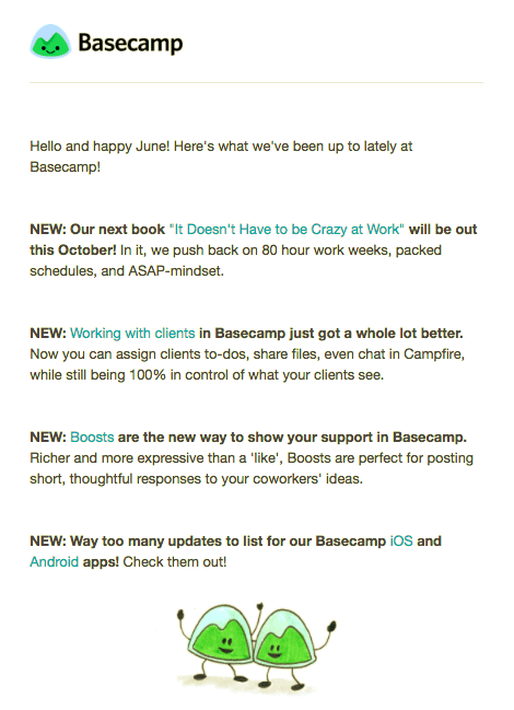
Not only is Basecamp telling me what a boost is but it’s also tying the feature back to the aha that their user onboarding has already established: zero hair-on-fire days at work.
The point is you don’t need emails and in-app banners and tooltips and demos and walkthroughs to get to a feature aha—your user onboarding has already done all the heavy lifting. The only reason I can think of to still have all of them reach everyone is awareness. But the thing is there are better ways to solve the awareness problem. After all, you have customer data, tons of it, and you can segment features by context, awareness, ability, and interest.
To conclude
If great user onboarding + poor feature adoption = product quicksand, then user onboarding + customer onboarding = runway to product success.
The nth mile matters just as much as the first.
Luckily user and customer onboarding complement each other in hugely beneficial ways. You can tweak your user onboarding flow to set up customer onboarding. And you can take the mindset that made user onboarding work forward so customer onboarding doesn’t start from scratch.
What’s more: when your user and customer onboarding are aligned, your users will have a more consistent experience with your product and who doesn’t want that?
Here are the deets for a quick skim:
A. You can lay the foundation for the nth mile when crafting the first by:
- setting up expectations for feature-driven success,
- introducing the core vocabulary that your product relies on, and
- ending the flow on a customer onboarding key.
B. Customer onboarding needn’t start from scratch because
- the product gets to an aha by tying core value to the promise on the homepage. Features do the same.
- And features don’t need a flow to get to an aha. By building on the aha you’ve established in your customers’ minds, you can facilitate a feature aha much faster.

